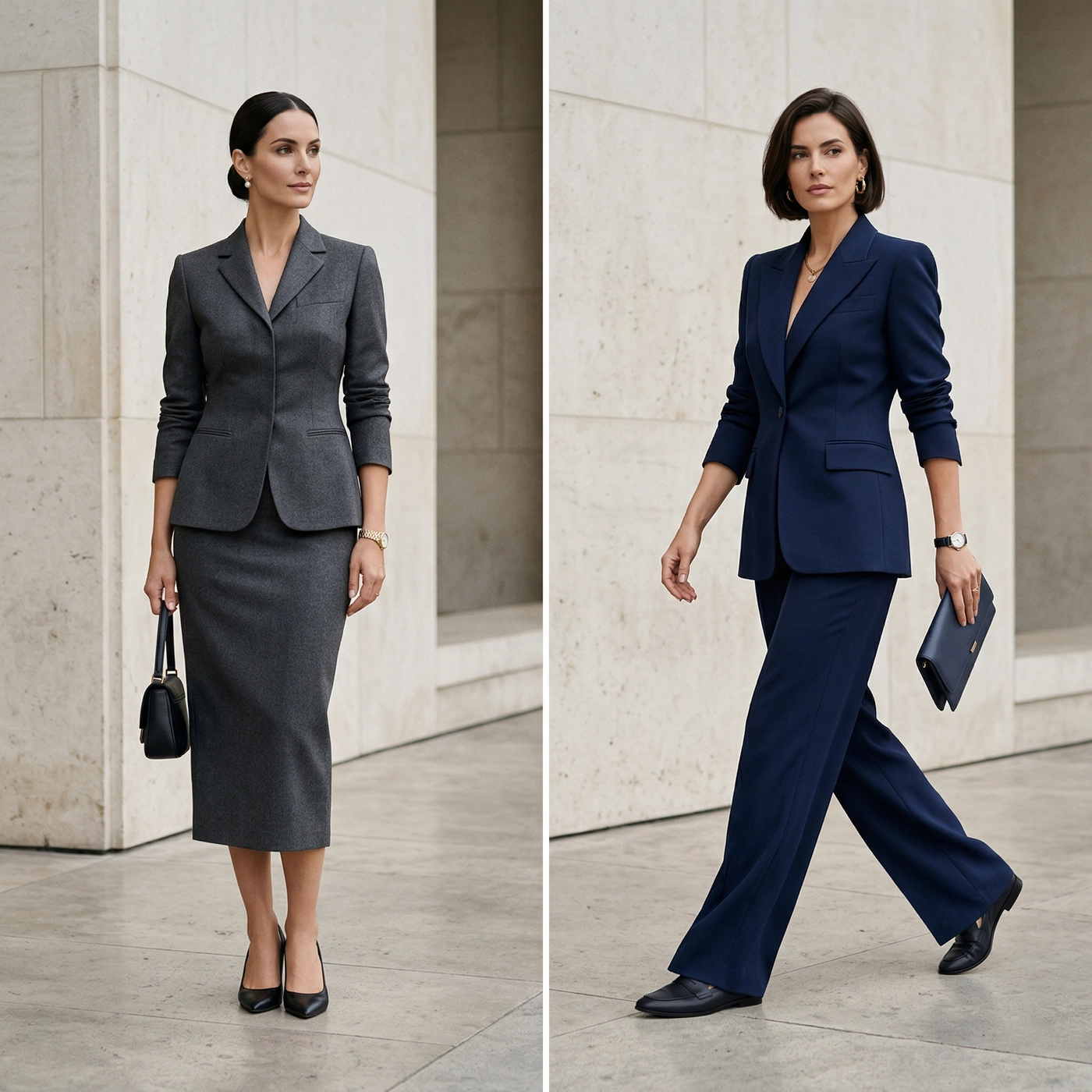
The Science of Elegance: The Ultimate Bespoke Tailoring Style Guide

This bespoke tailoring style guide begins with a fundamental truth: true elegance is rarely accidental, but rather a calculated equation of optics, geometry, and proportion. While you may own a wardrobe full of immaculate bespoke suits, a technically perfect fit can fail instantly if the visual measurements are misaligned. It is the interplay of hue, scale, and surface interest that distinguishes an outfit that is merely “expensive” from one that is truly exceptional.
Our objective is to strip away the guesswork and replace it with a foundational framework based on three distinct variables: Color, Pattern, and Texture. Whether you are selecting a standalone suit jacket or commissioning a full ensemble, understanding these principles will help you move beyond simply dressing “correctly” to dressing with intent. This is the science of transforming a styling decision from a moment of hesitation into an exercise in confident engineering.
Color Theory – The Foundation of Visual Impact
Color is the first signal the human eye registers. While artists use the standard Color Wheel to mix paint, the master tailor uses a refined version: let’s call it “The Sartorial Wheel.”
In standard color theory, colors are arranged by their raw chromatic relationship. In bespoke tailoring, we apply a filter of “Desaturation.” We rarely use primary colors in their raw form. Instead of pure Red, we use Burgundy (red with black added); instead of bright Yellow, we use Cream or Oatmeal. Understanding this concept allows you to navigate two critical variables: Temperature and Contrast.
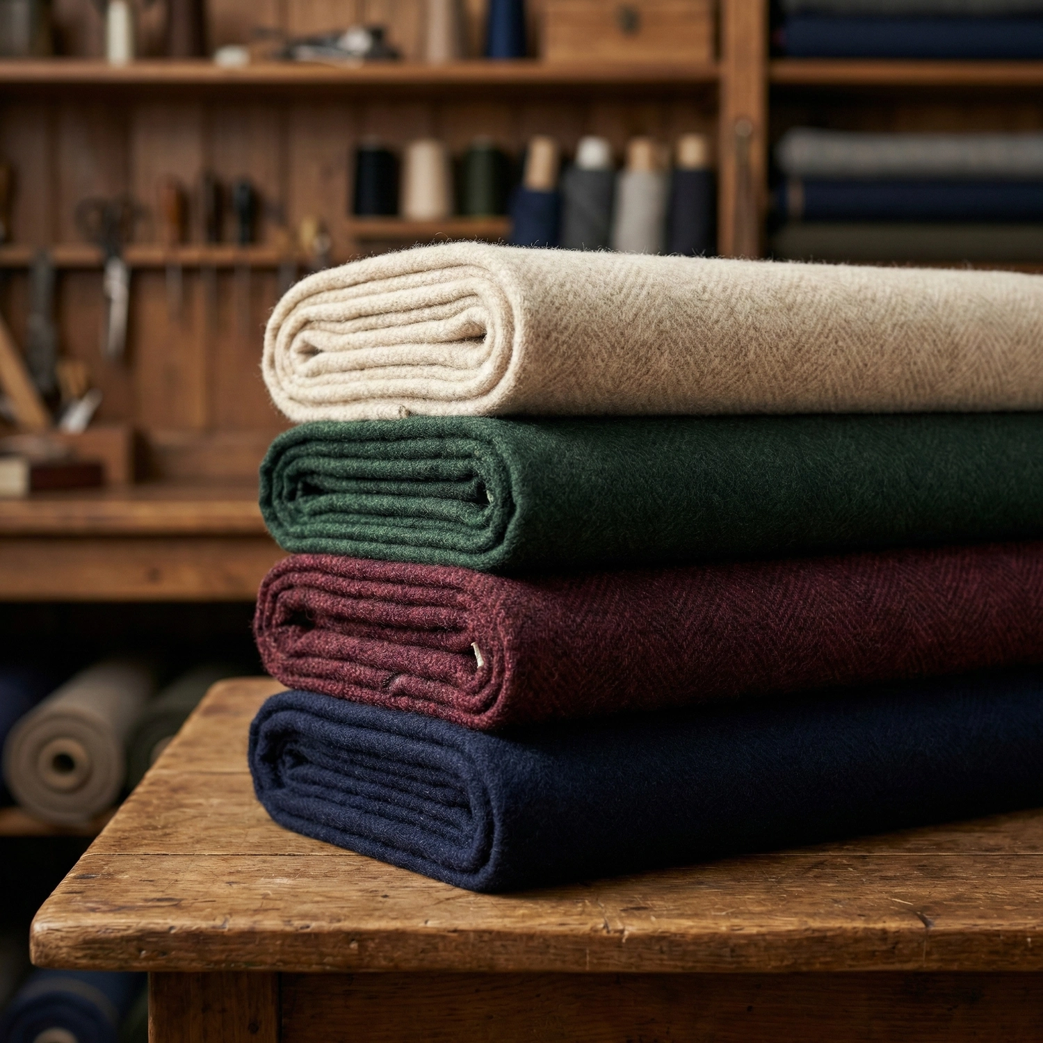
The Menswear Spectrum: Warm vs. Cool
The first rule of the Sartorial Wheel is Temperature.
- Cool Tones: Occupying the “Blue-Grey-Black” side. This is the foundation of business attire, projecting authority and sharpness.
- Warm Tones: Occupying the “Brown-Beige-Green” side. These shades project approachability and sophistication.
The “Bridge” Technique
A common mistake is clashing temperatures—for example, a stark, cold Grey suit worn with warm Tobacco Brown shoes often looks disjointed. The solution is to introduce a “Bridge”—a neutral element that mediates between the two.
Example: An Ivory or Cream shirt acts as the perfect bridge. It contains the lightness of a dress shirt but carries a warm undertone that links the cold Grey suit to the warm Brown shoes seamlessly.
The Rule of Contrast
The most scientific way to select colors is to mirror the natural contrast of your physical features (Skin Tone & Hair Color).
- High Contrast: If you have pale skin and dark hair, or deep skin tone with high-contrast eyes/teeth, you possess “High Visual Contrast.”
The Strategy: Your clothing should replicate this intensity. Pair a dark Navy suit with a crisp White shirt. This sharp difference mimics your natural features, framing the face powerfully.
- Low/Muted Contrast: If you have light skin and light hair (e.g., blonde or light grey), your natural contrast is subtle.
The Strategy: Avoid harsh Stark White shirts, which can overpower your complexion and make you look “washed out.” Instead, opt for softer transitions. A Light Blue or Eggshell shirt creates a harmonious balance with your bespoke suit, maintaining elegance without overwhelming your features.
Monochromatic Mastery (Tonal Dressing)
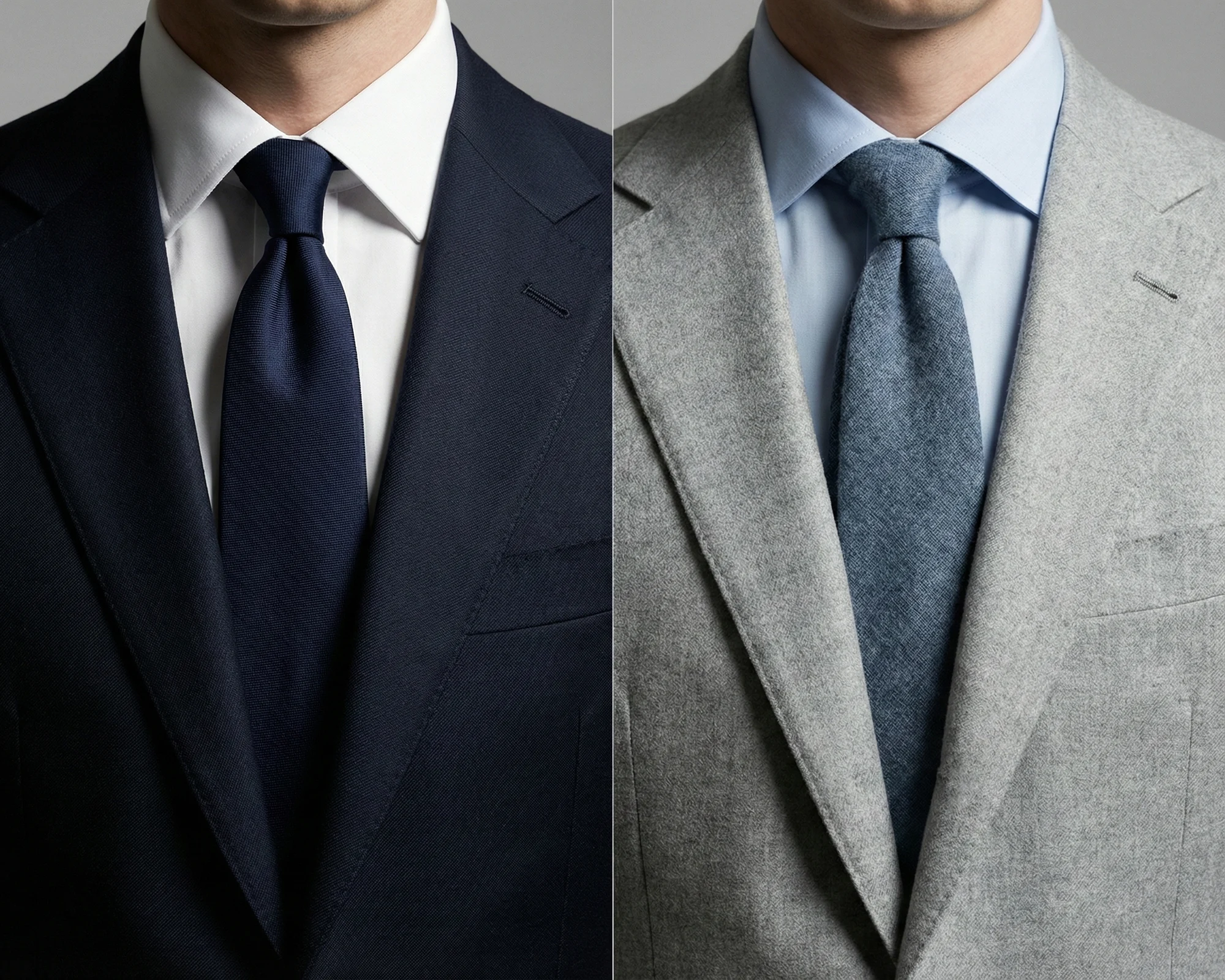
This relies on the Analogous concept of the Color Wheel—using colors that sit next to each other. In tailoring, this translates to Tonal Dressing: wearing different shades of the same color family.
Example: A Midnight Blue suit, paired with a Sky Blue shirt and a Navy grenadine tie. This creates an unbroken vertical line, elongating the silhouette and offering a “Quiet Luxury” aesthetic.
To master the precise mechanics of layering shades and textures, read our deep dive: [Monochromatic Mastery: The Sophistication of Tonal Dressing].
Expanding the Palette: Earth Tones & Pastels
Once the foundation of Navy and Grey is established, the modern gentleman should look to expand the palette using desaturated hues.
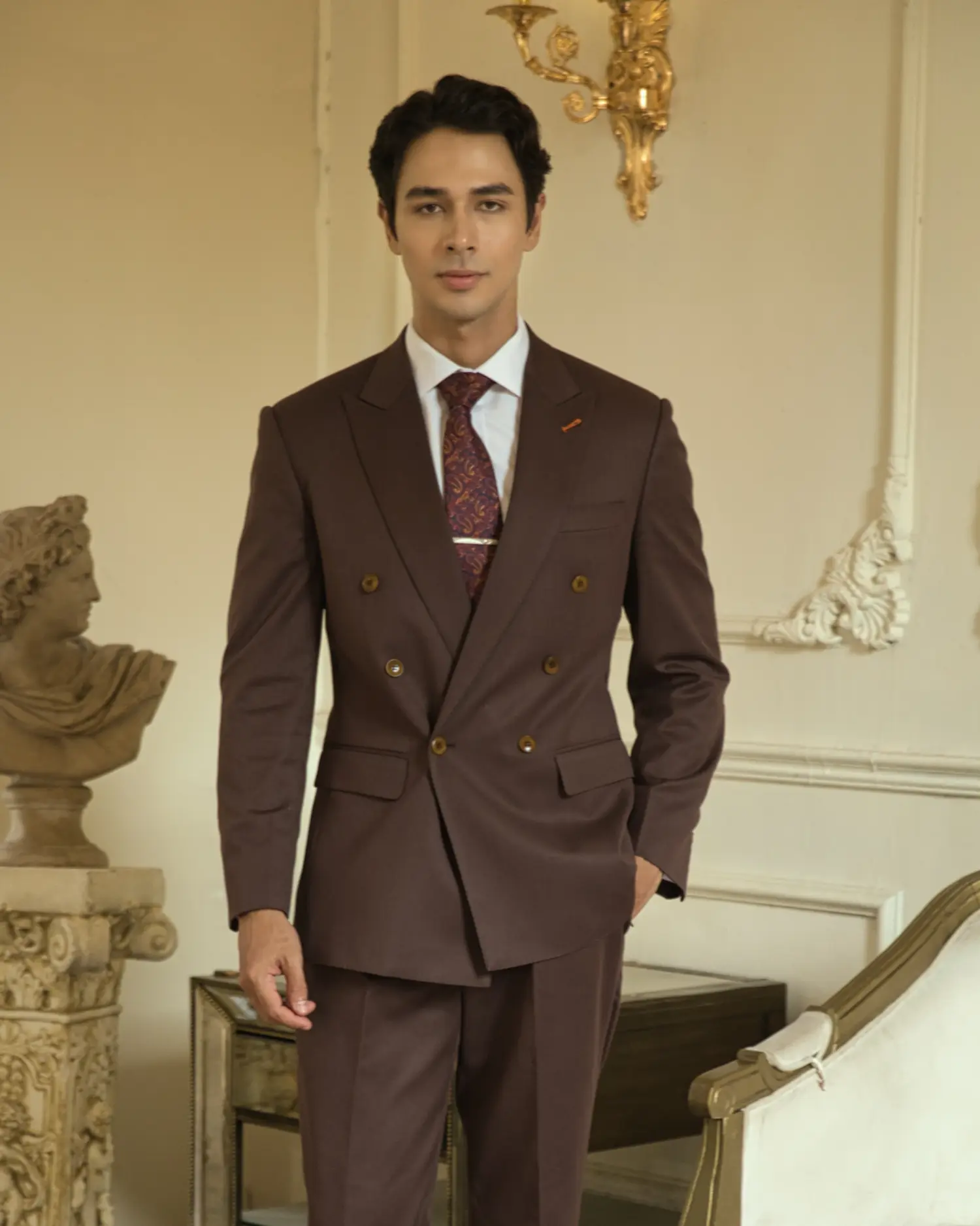
- Earth Tones: Colors like Chocolate Brown or Forest Green are excellent alternatives to Grey. They are particularly effective in textured fabrics like Flannel.
- Pastels: Far from being merely “fashionable,” muted pastels (like dusty pink or pale sage) act as a neutralizer in summer tailoring, softening the rigidity of a formal look.
Ready to step into the Warm Spectrum? Discover the protocols for wearing these colors with authority in our guide: [Beyond the Blue: Introducing Earth Tones and Pastels to Your Wardrobe].
Pattern Mixing – The Geometry of Sophistication
If color sets the mood, pattern creates the “rhythm” of an outfit. Introducing patterns is the quickest way to elevate a look from standard to individualistic, but it also carries the highest risk of visual dissonance. The secret to mixing patterns successfully lies not in artistic intuition, but in a geometric concept called Scale.
The Rule of Scale: Macro vs. Micro
The golden rule of pattern mixing is simple: Never place two patterns of the same size next to each other. When two patterns of identical scale (e.g., a narrow pinstripe suit jacket and a narrow striped shirt) intersect, they fight for the eye’s attention. This creates a vibration effect (known as moiré), which is dizzying to the viewer.
To achieve harmony, you must maximize the difference in scale:
- The Concept: Think in terms of “Macro” (Large) vs. “Micro” (Small).
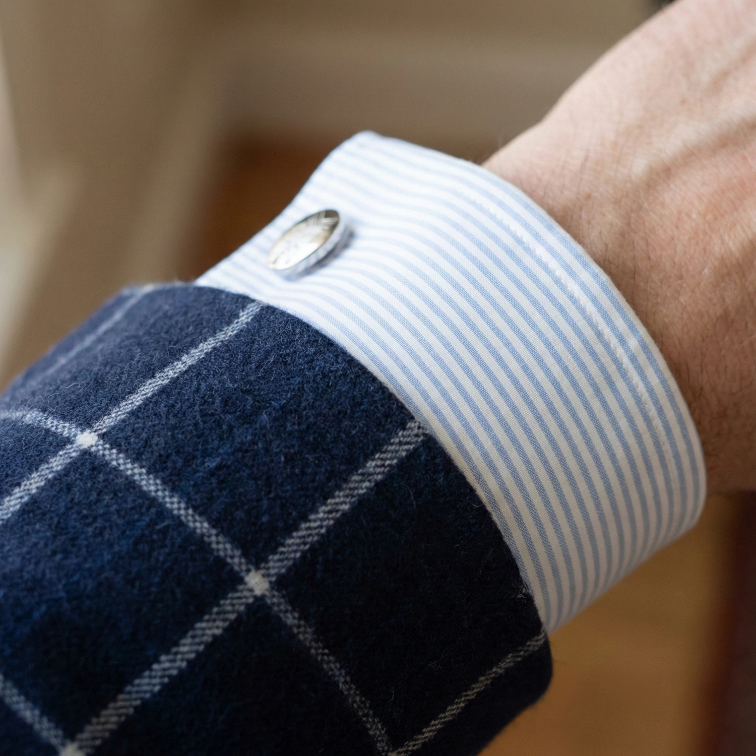
- The Application: If your suit has a large, bold Windowpane check (Macro), your shirt should have a micro-check or a fine stripe (Micro). This distinct size difference allows the eye to separate the layers clearly.
Visual Hierarchy: Dominant vs. Subtle
Every outfit needs a “Hero” piece. In bespoke tailoring, you cannot have the suit, the shirt, and the tie all shouting for attention simultaneously. You must establish a hierarchy.
- The Background: Usually, the suit acts as the canvas. If the bespoke suit is heavily patterned (like a Glen Plaid or Chalk Stripe), it is the Dominant element.
- The Accompaniment: In this case, the shirt and tie should be quieter (solid colors or very subtle textures) to support the suit.
- The Inversion: Conversely, if the suit is a solid Navy or Charcoal, you have the freedom to make the shirt or tie the “Hero” with a bolder pattern.
Common Mistakes: The Geometric Trap
While mixing patterns shows confidence, certain combinations are notorious for causing visual clutter.
- Stripes on Stripes (The Barcode Effect): Wearing a pinstripe bespoke suit with a striped shirt and a striped tie often makes you look like a walking barcode.
The Fix: If you must mix stripes, vary the orientation and width drastically. However, the safer and more elegant route is to introduce a different shape entirely.
- Checks on Checks (The Gridlock): Mixing a checked suit with a checked shirt is technically difficult. It often creates a confusing grid that hides the body’s form.
The Fix: Contrast the geometry (wear a Striped shirt). If you insist on wearing Check on Check, you must apply the Macro vs. Micro rule strictly: A large Windowpane suit can theoretically accept a tiny Micro-check shirt, but the margin for error is slim.
The “2 out of 3” Formula
For those beginning to experiment with patterns, the mathematical safety net is the “2 out of 3” formula. This refers to the three core components: Jacket, Shirt, and Tie.
Level 1 (Safe): 1 Pattern + 2 Solids.
Example: A striped shirt worn with a solid suit and a solid tie. This is impossible to get wrong and always looks professional.
Level 2 (The Sweet Spot): 2 Patterns + 1 Solid.
Example: A Prince of Wales check suit (Pattern 1) + A solid light blue shirt (Solid) + A polka dot tie (Pattern 2). The solid shirt acts as a “buffer zone” between the two patterns.
Level 3 (Advanced – The Geometric Trinity): 3 Patterns.
- True mastery is not just about size, but about mixing different geometries.
- The Formula: Combine a Prince of Wales Check suit (Geometric/Grid) + A Bengal Stripe shirt (Linear) + A Paisley or Medallion tie (Organic/Curved).
- Why it works: Because the shapes are fundamentally different, they do not compete. The eye reads them as three distinct layers of depth rather than a chaotic mess.
To master the nuances of specific motifs beyond these formulas, read our in-depth guide: [Stripes, Checks, and Dots: The Golden Rules of Mixing Patterns]
Texture – The Silent Dimension
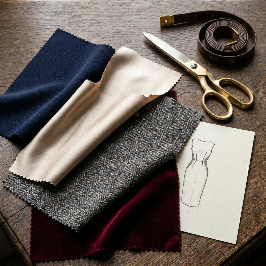
While color catches the eye and pattern holds attention, Texture is what invites the touch. It is the “silent dimension” of style. In the digital age, where meetings often happen on flat screens, texture is the element that restores depth and three-dimensionality to your presence.
A common mistake among men is focusing solely on the “Super numbers” (Super 120s, 150s), implying that smoother is always better. In reality, a complete wardrobe requires a mastery of surface interest.
The Physics of Light: Absorption vs. Reflection
To understand texture scientifically, we must look at how fabric interacts with light.
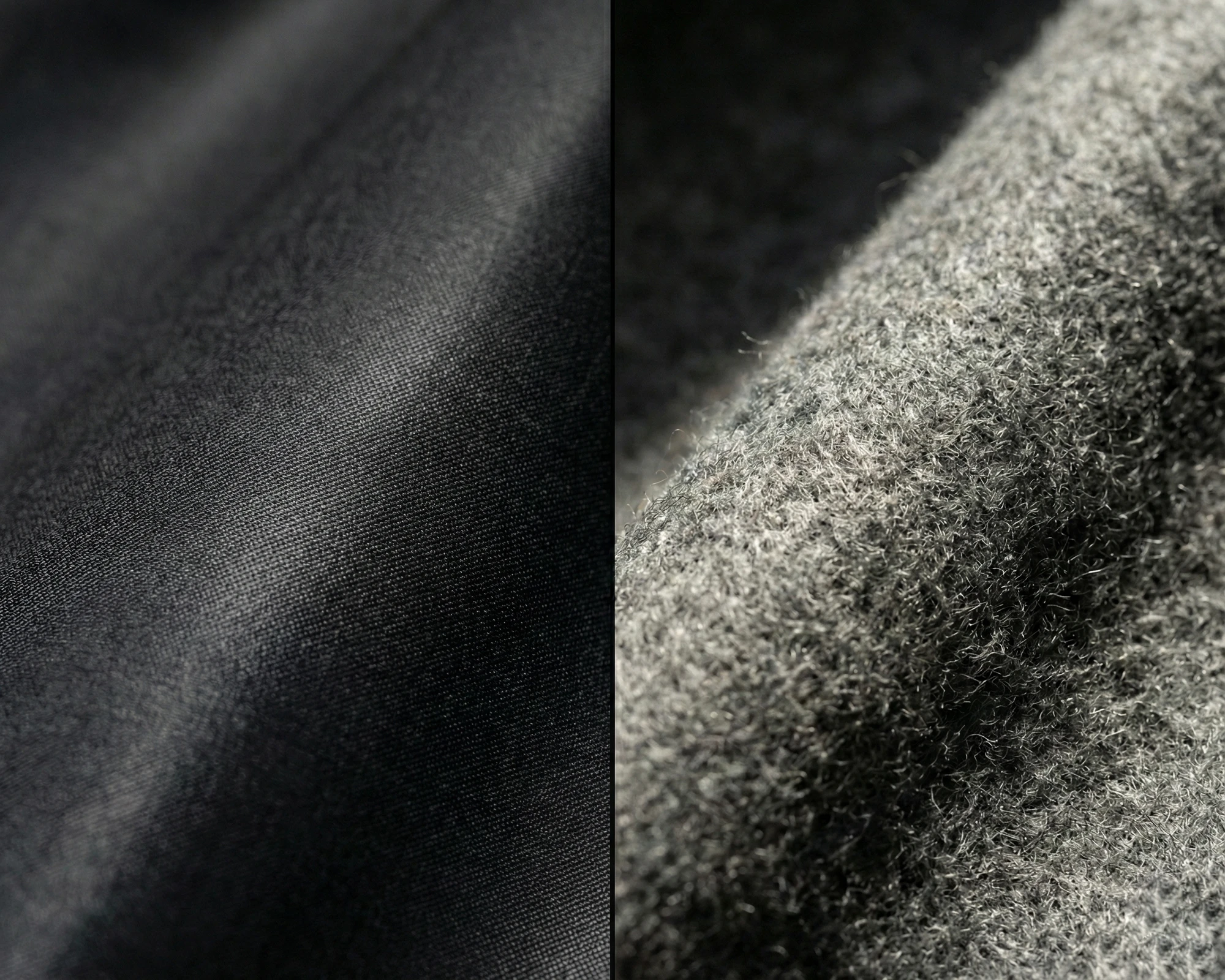
- High-Luster Fabrics (Formal): Fine worsted wools, sharkskin, and silk. These fabrics reflect light, creating a clean, sharp, and “armored” look. This natural sheen is the standard for high-stakes boardrooms and evening events.
- Light-Absorbing Fabrics (Approachable): Flannel, Tweed, Linen, and Cashmere. These fuzzy or uneven surfaces trap light rather than reflecting it. This softens the silhouette and creates an air of approachability and richness.
The Strategy: Use texture to control the formality of your message. A lustrous, high-twist wool bespoke suit says “Business Precision,” while a matte grey flannel bespoke suit says “Old Money Confidence.”
Texture Contrast: Creating Depth
Just as we mix colors, we must mix textures. If an outfit is entirely sleek (high-sheen suit + lustrous satin tie + smooth shirt), it risks looking flattened, or worse, creating an artificial “shiny” look associated with lower quality.
- The Rule of Opposites: The most sophisticated looks often pair opposing textures.
- Example: Pair a smooth, Super 130s Navy Suit (High Luster) with a Grenadine or Knit Tie (Matte/Textured). The crunchiness of the tie against the sheen of the suit jacket creates a tactile contrast that is visually satisfying without being loud.
If you find your outfits consistently lacking this depth, you might be stuck in a common sartorial error. Learn how to identify and fix this issue in our focused guide: [Mastering Menswear Texture: Escaping the “Flatness Trap”]
Seasonality: The Language of Weather
Texture is also your primary indicator of seasonal appropriateness. Wearing a “4-season suit” year-round is functional, but predictable.
- Summer: Linen and Fresco wool. These fabrics have an “open weave” texture that looks airy and crisp. The natural slubs (uneven threads) of linen are not defects; they are the visual signature of summer elegance.
- Winter: Flannel and Corduroy. The “nap” (fuzzy surface) of these fabrics visually communicates warmth and insulation.
The Grand Unification: Applying This Bespoke Tailoring Style Guide
Understanding Color, Pattern, and Texture individually is like learning to play scales on a piano. Mastering the combination of all three is what allows you to compose a symphony.
The Holistic View: The “Equalizer” of Style
Before diving into specific outfits, you must understand how these three elements interact as a system. Think of your outfit like a Sound Equalizer with three sliders: Color, Pattern, and Texture.
- The Law of Compensation: You cannot push all three sliders to the maximum volume simultaneously. If you push Pattern up (e.g., a bold Checked suit), you must pull Color down (stick to neutrals) and keep Texture moderate to prevent visual distortion.
- The “One Lead, Two Supports” Rule: In any successful ensemble, only one element should shout; the others must whisper. For instance, if a Heavy Tweed Suit Jacket (Texture) is your lead, keep your patterns simple; conversely, if a Chalk Stripe Suit (Pattern) is the lead, keep the shirt solid and the texture smooth.
By viewing your outfit as a holistic equation of trade-offs, you avoid the common mistake of “over-styling.”
Case Study 1: The “Boardroom Authority” (Focus on Contrast & Texture)
The Goal: To project power, precision, and unwavering professionalism.
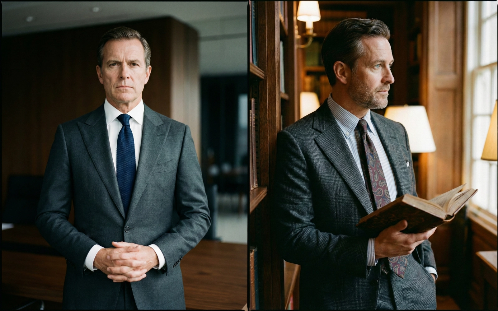
The Foundation (Suit): A Charcoal Grey or Navy Worsted Wool bespoke suit.
- Color: Deep, Cool tone.
- Pattern: Solid or a very subtle Micro-herringbone (visible only up close).
- Texture: High luster (Clean finish).
The Variable (Shirt): A Crisp White Poplin shirt.
- Color: High Contrast against the suit.
- Pattern: None (Solid).
- Texture: Smooth.
The Unifier (Tie): A Navy or Burgundy Grenadine Tie.
The Science: Here is where the magic happens. Since the suit and shirt are simple solids, the tie must provide depth. The garza (gauze) weave of the Grenadine adds a rich, complex Texture that breaks the flatness of the outfit without introducing a loud pattern.
The Result: A look that is low in pattern distraction but high in textural sophistication.
Case Study 2: The “Sartorial Connoisseur” (Focus on Pattern & Color Harmony)
The Goal: To project creativity, approachability, and deep knowledge of style (Ideal for social events or creative industries).
The Foundation (Suit): A Prince of Wales Check suit in Mid-Grey.
- Color: Neutral.
- Pattern: Geometric (Grid). This is the “Lead” actor.
- Texture: Flannel (Matte, light-absorbing).
The Variable (Shirt): A Pale Blue Bengal Stripe shirt.
- Pattern: Linear (Stripes).
- Scale: The stripes must be significantly smaller/thinner than the checks of the suit (Macro vs. Micro).
The Unifier (Tie): A Solid Rust/Tobacco Wool Tie OR An Ancient Madder Paisley Tie.
- The Safe Choice: A solid wool tie in a warm Earth Tone grounds the busy patterns.
- The Advanced Choice: For the true virtuoso, introduce a large-scale Paisley or Medallion print. The organic curves of the paisley will soften the rigid geometry of the checks (suit) and stripes (shirt), achieving the perfect “Geometric Trinity.”
The Result: A masterclass in mixing geometries while using warm tones to balance the cool blue/grey base.
The Final Check: The “Squint Test”
Before leaving your residence, stand in front of a full-length mirror and perform the “Squint Test” (narrow your eyes until your vision blurs slightly). This removes the details and leaves only the overall composition.
The Diagnosis & The Quick Fix:
- Problem: The tie disappears into the shirt.
The Fix: You lack contrast. Swap it immediately for a Solid Navy Tie. A dark solid tie acts as a “reset button” for the chest area.
- Problem: The chest area looks vibrating or muddy.
The Fix: You have clashed scales. Remove the patterned pocket square and switch to a plain White linen fold. If it’s still busy, revert to a solid white shirt.
Conclusion: Owning Your Image
We have traversed the science of Color, Pattern, and Texture, but do not let these rules become a cage. If this framework feels overwhelming, remember that true sophistication is a practice, not a destination.
Start small. There is wisdom in mastering the simplicity of Case Study 1 before attempting complex combinations. When in doubt, return to the guiding principle: Simple is Safe. A perfectly fitted Navy suit with a white shirt always commands respect. Eventually, these calculations will become instinct. You dress well not because you memorized the rules, but because you understand them.
DISCOVER PHYIGITAL BESPOKE TAILORING