Monochromatic Mastery: The Sophistication of Tonal Dressing

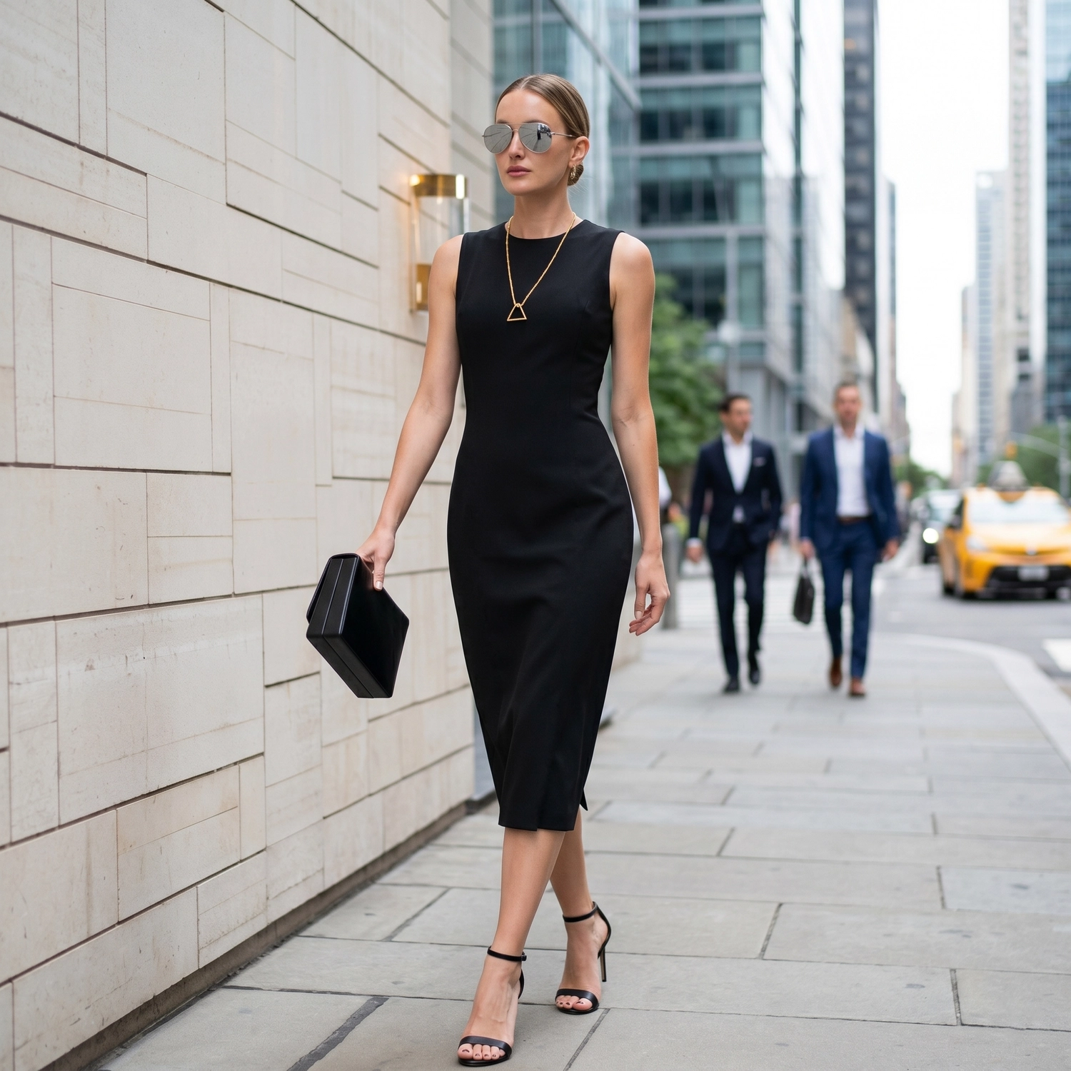
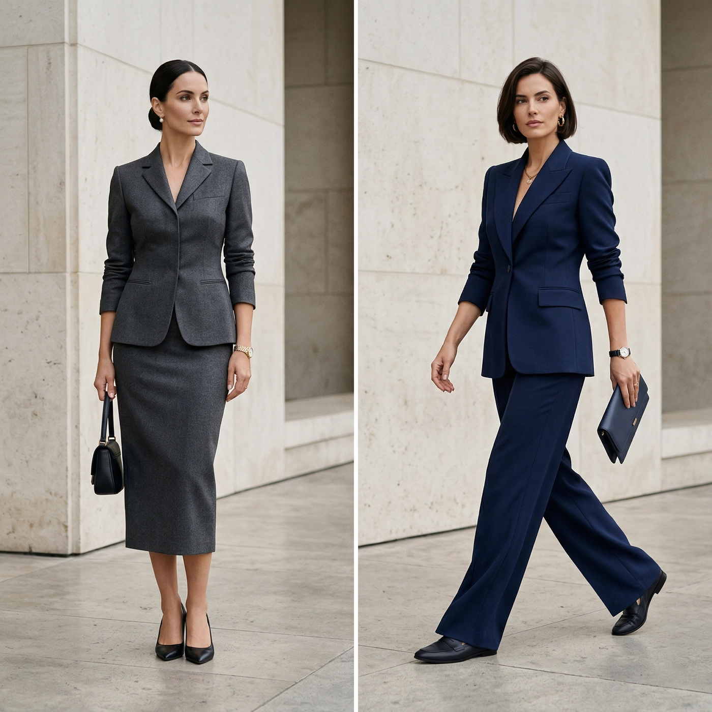
In a boardroom cluttered with aggressive patterns and loud contrasts, the most commanding presence is often the quietest. This is the power of Tonal Dressing.
Far from being a safe “uniform,” true monochromatic styling is a sophisticated exercise in restraint: a hallmark of the “Quiet Luxury” movement. It is not about simply matching a bespoke suit to a shirt of the exact same color; that is a recipe for looking flat. Instead, it is the art of “Layering Light.”
By manipulating different shades (values) and textures within a single color spectrum, you create depth without relying on the crutch of high contrast. This guide will dismantle the mechanics of this architectural aesthetic, teaching you how to project authority through the science of nuance.
The Science of the “Vertical Column”
Why does Tonal Dressing consistently appeal to world leaders, architects, and designers? The answer lies not in fashion, but in optics.
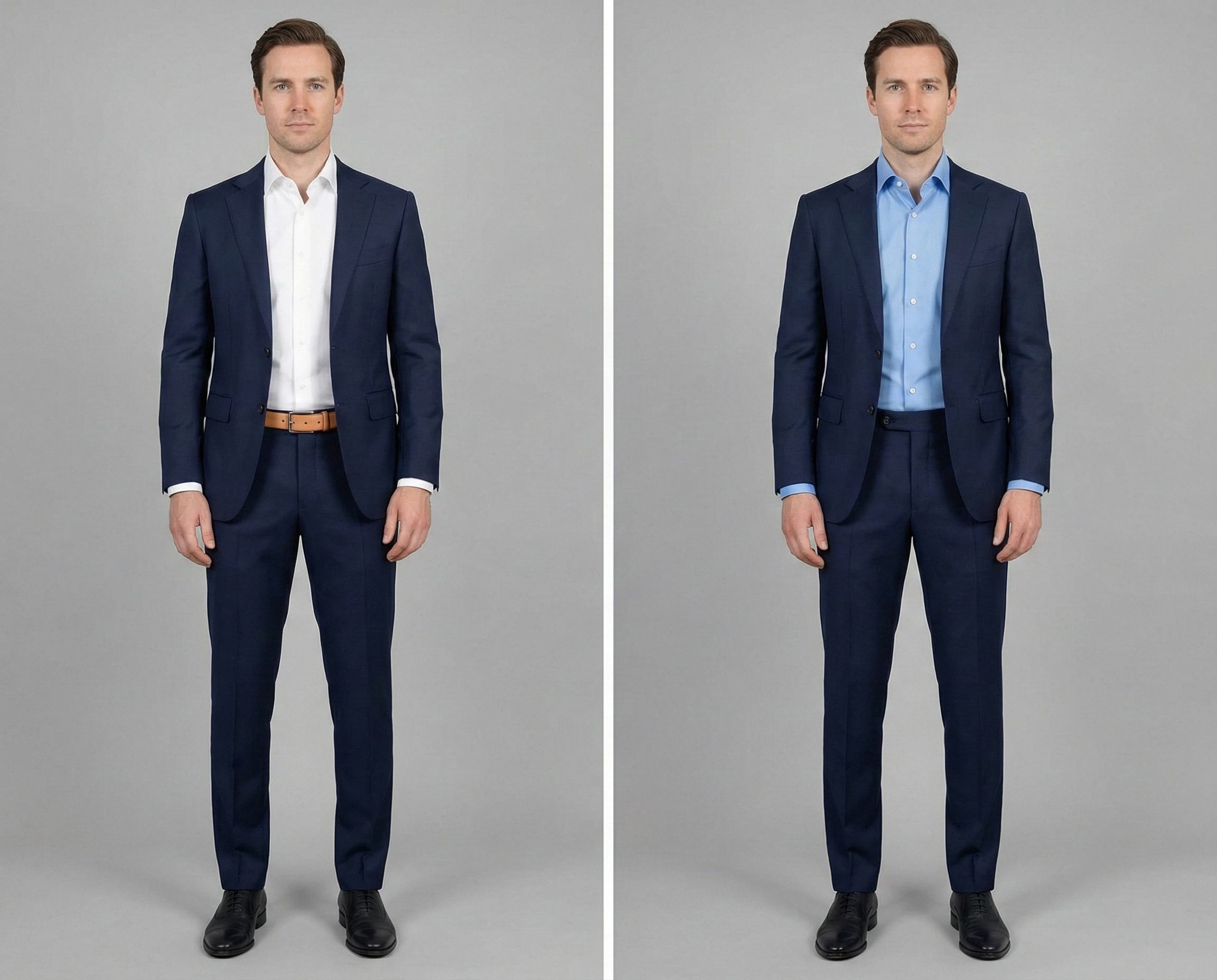
When you dress with high contrast (for example, a dark jacket, a bright white shirt, and lighter trousers) you create horizontal “blocks” across your body. These blocks act as visual speed bumps, forcing the viewer’s eye to stop and start as it scans your silhouette. This breaks the body into fragmented parts.
Tonal dressing operates on the opposite principle: Visual Continuity.
1. The Unbroken Trajectory (Elongation)
By reducing the contrast between your trousers, waist, and chest, you create a single, uninterrupted vertical line.
- The Mechanism: Without horizontal interruptions (like a bright belt or a starkly contrasting shirt), the human eye naturally glides from your shoes to your collar in one smooth motion.
- The Result: This optical illusion maximizes verticality. Regardless of your physical height, a monochromatic bespoke suit ensemble makes you appear taller, leaner, and more statuesque. It removes visual “bulk.”
2. The “Face-First” Hierarchy
High-contrast clothing competes for attention. A loud tie or a jarring shirt color draws the eye toward the torso. Tonal dressing neutralizes this distraction.
- The Strategy: By keeping the body’s palette muted and uniform, you force the viewer’s gaze upward.
- The Payoff: The attention is immediately funneled to your face and your eyes. In high-stakes negotiations, this is a tactical advantage: your clothes provide the frame, but your face remains the undisputed focal point.
The Mechanics of the Spectrum: How to Layer Shades
The most common failure in tonal dressing is the “muddy” effect: where the suit, shirt, and tie blend into an indistinguishable mass. To avoid this, you must stop thinking of color merely as “Blue” or “Grey” and start thinking in terms of Luminance (Lightness).
To execute this flawlessly, we apply three distinct rules.
1. The Nature Anchors: Naming Your Shades
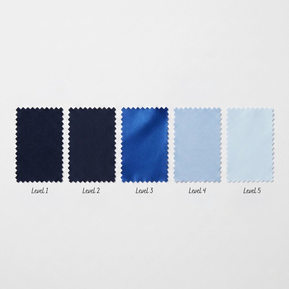
Forget abstract color codes. To master the gradient, you need a mental anchor for each level of brightness.
Note: We will use the Blue Spectrum below as our primary case study (due to its dominance in classic menswear), but this 5-Level logic applies universally. You should apply the exact same gradient thinking to Greys (Charcoal to Silver) or Earth Tones (Espresso to Beige).
Imagine the color of the sky changing throughout the day:
- Level 1 (Darkest): Midnight Blue. The color of the night sky. It is so deep it often looks black under indoor lighting and only reveals its blue tone in natural sunlight.
- Level 2 (Dark): Navy Blue. The standard business shade. Distinctly blue, but authoritative and grounded.
- Level 3 (Medium): French Blue / Royal Blue. The mid-day sky. It is vibrant and saturated. In tonal dressing, this is used sparingly as an accent (e.g., a tie or pocket square), never the main event.
- Level 4 (Light): Sky Blue. The classic dress shirt color. Soft, airy, and approachable.
- Level 5 (Lightest): Ice Blue. A white shirt with a drop of blue ink. It provides the highest contrast while remaining within the tonal family.
2. The “Smartphone Test” (The Luminance Check)
It can be difficult for the human eye to judge contrast between similar colors. To verify if your outfit works, use technology to strip away the hue.
- The Method: Before leaving the house, take a photo of your outfit using your smartphone.
- The Filter: Edit the photo and apply a Black & White (Mono) filter.
- The Diagnosis:
Pass: If your suit, shirt, and tie appear as three distinct shades of grey (Dark Grey, Light Grey, and Medium Grey), your outfit has sufficient contrast.
Fail: If the outfit looks like a single, flat block of grey, you have “muddy” contrast. You need to swap the shirt for a lighter shade.
3. The “Two-Step Drop” Rule & The Tie Strategy
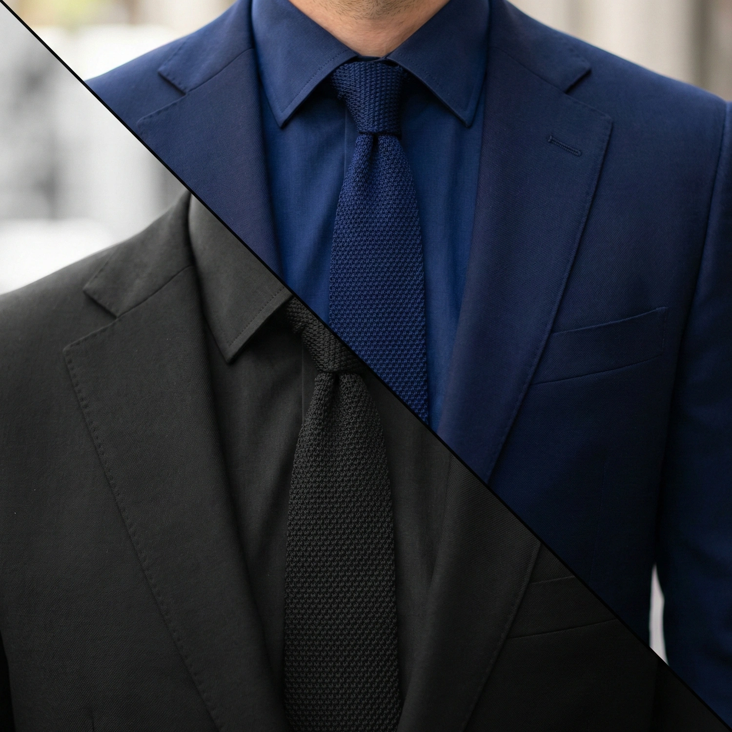
A “Near Match” is the enemy of elegance. Wearing a Midnight Blue suit (Level 1) with a Navy shirt (Level 2) often looks accidental, as if you tried to match them but failed.
To solve this, use The “Tonal Sandwich” Formula. This creates a perfect High-Low-High contrast rhythm:
- The Frame (Suit): Level 1 (Midnight Blue). This provides the darkest boundary.
- The Core (Shirt): Level 4 (Sky Blue). Jump at least 2-3 levels lighter than the suit. This lightness illuminates the face.
- The Bridge (Tie): Level 2 (Navy Blue). This is the critical missing link. The tie should be darker than the shirt but slightly lighter (or visually distinct) from the suit.
Why this works: The dark Suit and dark Tie effectively “sandwich” the light Shirt. This creates a sharp, defined V-shape at the chest, ensuring you look crisp and deliberate, not washed out.
4. The Hidden Trap: Undertone Consistency
Finally, ensure the “Temperature” of your shades is consistent.
- Cool Blues: Have a purple undertone.
- Warm Blues: Have a green/teal undertone.
- The Mistake: Do not mix a “Teal-Blue” tie (Warm) with a “Purple-Navy” suit (Cool). Even though both are blue, the clash in undertones will create a subtle visual dissonance that makes the outfit feel “off” without the viewer knowing why.
Texture: The Silent Variable
If Color is the volume of your outfit, Texture is the equalizer.
When you master Tonal Dressing, you are essentially turning the volume of Color down to a whisper. To prevent the outfit from becoming “silent” (boring or flat), you must adjust the other slider: Texture.
The most sophisticated monochromatic looks rely on a simple rule of physics: The Law of Surface Contrast.
The Trap of Flatness
Imagine wearing a smooth worsted wool bespoke suit, a smooth broadcloth bespoke shirt, and a smooth satin tie. Even if the colors are perfectly graded, the outfit will fail. Why? Because every surface reflects light in the exact same way. The result is a “slick,” two-dimensional appearance that lacks character.
The Solution: Mix “Matte” with “Shine”
To create separation between layers of the same color, you must vary how they interact with light.
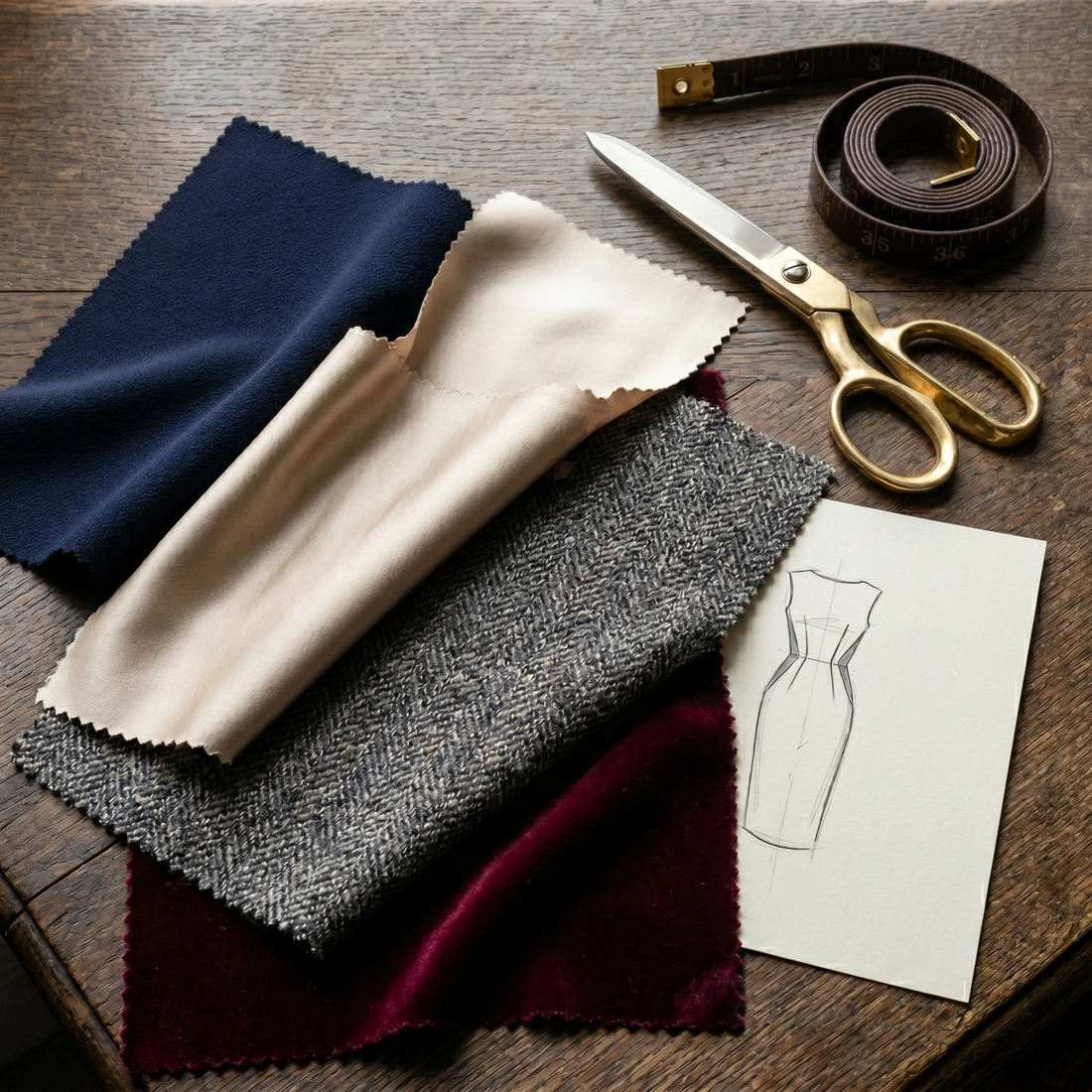
- Light-Absorbing Fabrics (Matte): Flannel, Linen, Fresco, Cashmere. These appear deeper and richer. They provide the “grounding” weight.
- Light-Reflecting Fabrics (Sheen): Silk, Satin, Mercerized Cotton (Poplin/Twill). These catch the light and create highlights.
The Golden Rule: Never place three “shiny” items or three “matte” items together. You need opposition.
The “Texture Triad” Formula
To execute this perfectly with a bespoke suit, aim for a mix of three distinct surface interests:
- The Canvas (The Suit): Opt for a fabric with a visible character. A Navy Flannel suit adds a soft, fuzzy depth, while a High-Twist Wool (like Fresco) offers a dry, matte finish. Both serve as a non-reflective anchor for the outfit.
- The Crisp Element (The Shirt): Keep this sharp. A smooth bespoke shirt in Poplin or fine Twill provides a clean, flat surface that contrasts against the textured weave of the suit.
- The Highlight (The Tie): This is where you add depth. Instead of a flat silk tie, choose a Grenadine (an open weave that looks like honeycomb) or a Knit Tie.
The Result: Even if your suit and tie are the exact same shade of Midnight Blue, the crunchy texture of the Grenadine tie separates it visually from the dry, matte finish of the High-Twist suit. The eye sees two distinct luxury items, not a uniform.
Master Palettes: Executing the Look
Theory is essential, but execution is what matters. To help you build your monochromatic wardrobe, we have curated three definitive palettes. Each corresponds to a specific mood and environment, ensuring you are never overdressed or underdressed, but always perfectly calibrated.
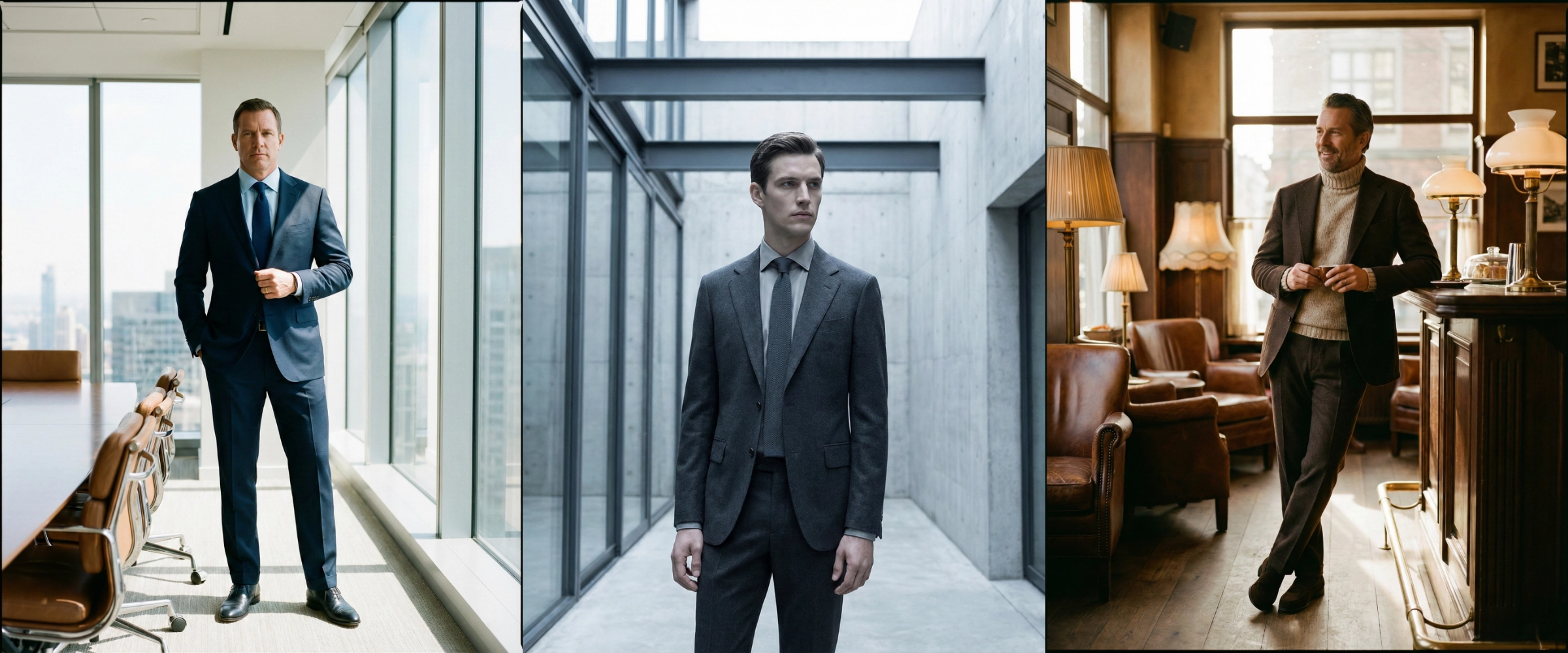
Palette 1: The Executive Blue (Power & Trust)
Best for: Board meetings, high-stakes negotiations, and formal business environments.
This is the gold standard of corporate style. It utilizes the Navy suit, the most trusted garment in menswear, but elevates it beyond the ordinary.
- The Anchor (Suit): A Midnight Blue Bespoke Suit. Dark, serious, and grounding.
- The Light (Shirt): A Sky Blue crisp poplin shirt. This creates a high contrast against the jacket, brightening the face.
- The Bridge (Tie): A Navy Blue Grenadine tie. It sits darker than the shirt but lighter (or texturally distinct) from the suit.
- Why It Works: It follows the “Tonal Sandwich” formula perfectly. The “High-Low-High” contrast rhythm ensures you look sharp and authoritative, not washed out.
Palette 2: The Architectural Greyscale (Intellect & Modernity)
Best for: Tech industries, creative directors, and urban evening events.
Grey is often accused of being dull. However, when executed tonally, it becomes “Industrial Chic.” This look is less about tradition and more about modern precision.
- The Anchor (Suit): A Charcoal Grey Flannel suit. It absorbs light, looking almost like matte concrete.
- The Light (Shirt): An Ice Grey or Silver shirt. Unlike a plain white shirt, the silver undertone binds it seamlessly to the jacket.
- The Bridge (Tie): A Slate or Graphite Grenadine tie.
Refinement: Since the flannel suit is soft and matte, avoid a wool tie (which would look too heavy). The open “crunchy” weave of the Grenadine adds necessary texture contrast without breaking the monochrome theme.
- Why It Works: This palette mimics the aesthetic of modern architecture: steel, glass, and concrete. It projects a cold, analytical intelligence that is highly prized in modern suit styles.
Palette 3: The Earth Tones (Soft Power & Approachability)
Best for: “Casual Fridays,” client dinners, or creative office environments.
This is the advanced level. It moves away from the rigidity of blue and grey into the warmth of browns. This is often associated with the “Old Money” aesthetic of Italian tailoring.
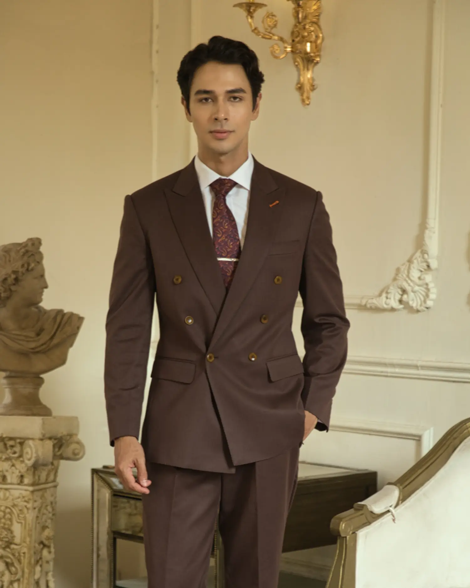
- The Anchor (Suit): A Dark Chocolate or Tobacco Brown suit.
- The Light (Shirt/Layer): A Cream or Beige shirt. Alternatively, swap the shirt for a fine-gauge Merino wool turtleneck in Oatmeal for a softer, relaxed look.
- The Bridge (Accessories): No tie is needed here. Instead, use a darker brown pocket square with a matte finish.
- Why It Works: Brown is inherently warm and approachable. By keeping the contrast low and the textures soft (think flannel and knitwear), you project confidence without the armor-like rigidity of business formal wear.
Conclusion: Whispering vs. Shouting
In the language of style, volume does not equal value.
Tonal Dressing is the ultimate proof that you do not need to shout to be heard. By stripping away the noise of high-contrast colors, you leave only the essential: the quality of the fabric, the precision of the fit, and the confidence of the man wearing the bespoke suit. It is a strategy of nuance, prioritizing depth over distraction.
However, mastering the monochrome is merely one chapter in the broader physics of style. To fully understand how these principles of color interplay with the geometric rules of pattern and proportion, we invite you to revisit our foundational guide: [The Science of Elegance: The Ultimate Bespoke Tailoring Style Guide].
DISCOVER PHYIGITAL BESPOKE TAILORING