Stripes, Checks, and Dots: The Golden Rules of Mixing Patterns

Mastering the art of mixing patterns is the definitive step that separates the well-dressed novice from the true sartorial expert. While a wardrobe of solid colors offers safety, it lacks the depth and character inherent in high-end bespoke tailoring: a core concept we explored in our foundational guide on [The Science of Elegance: The Ultimate Bespoke Tailoring Style Guide]. Rest assured, combining motifs is not a guessing game of artistic intuition; it is a precise science governed by three immutable rules of geometry. Master them, and your wardrobe transforms from static to dynamic instantly.
The Anatomy of Patterns
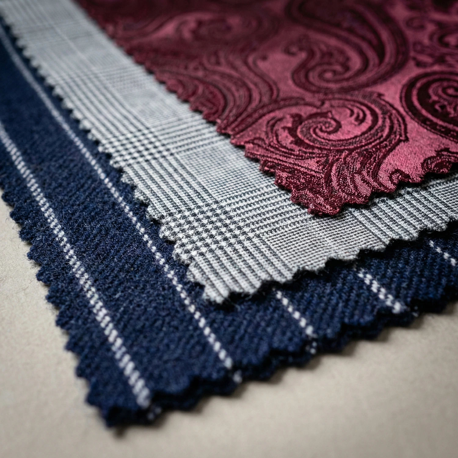
To mix effectively, you must first understand the geometric properties of the three main players in your closet. We categorize them not by color, but by their directional force.
- The Linear (Stripes): Think of continuous parallel lines. These define verticality and authority. Ranging from the faint hairline stripe to the bold chalk stripe, they draw the eye up and down, creating an elongating effect. This category includes the foundation of business attire: the classic pinstripe suit.
- The Grid (Checks): Think of lines crossing at right angles. These define structure and visual breadth. Ranging from the intricate Glen Plaid to the bold Windowpane, checks create a boxed effect. A checked bespoke suit often projects a mood that is more “sporty” and approachable than its striped counterpart.
- The Organic (Dots & Curves): Think of soft, isolated shapes. These patterns lack straight lines. Whether it is the repeated circles of a polka dot or the teardrop swirl of a paisley, they introduce softness and fluid movement, acting as a necessary relief from the rigid straight lines of tailoring.
Golden Rule 1: The Rule of Scale (Macro vs. Micro)
If you memorize only one rule from this guide, let it be this: Contrast in size is non-negotiable.
The most frequent failure in mixing patterns does not come from clashing colors or shapes, but from clashing scales. When two patterns of the same size sit next to each other, they fight for the eye’s attention, resulting in a look that is busy and confused.
The Science: Avoiding the “Moiré Effect”
In physics and optics, when two identical grid-like patterns are overlaid or placed adjacent to one another, they create a visual interference pattern known as the Moiré Effect.
In menswear, this translates to “visual vibration.” If you wear a narrow striped shirt under a narrow striped bespoke suit, the lines will appear to shimmer or blur when you move, making the viewer feel dizzy. To prevent this, the eye needs a clear distinction between the layers.
The Formula: Macro vs. Micro
To achieve harmony, you must maximize the difference in density between your garments. Think in terms of Macro (Large/Bold) and Micro (Small/Intricate).
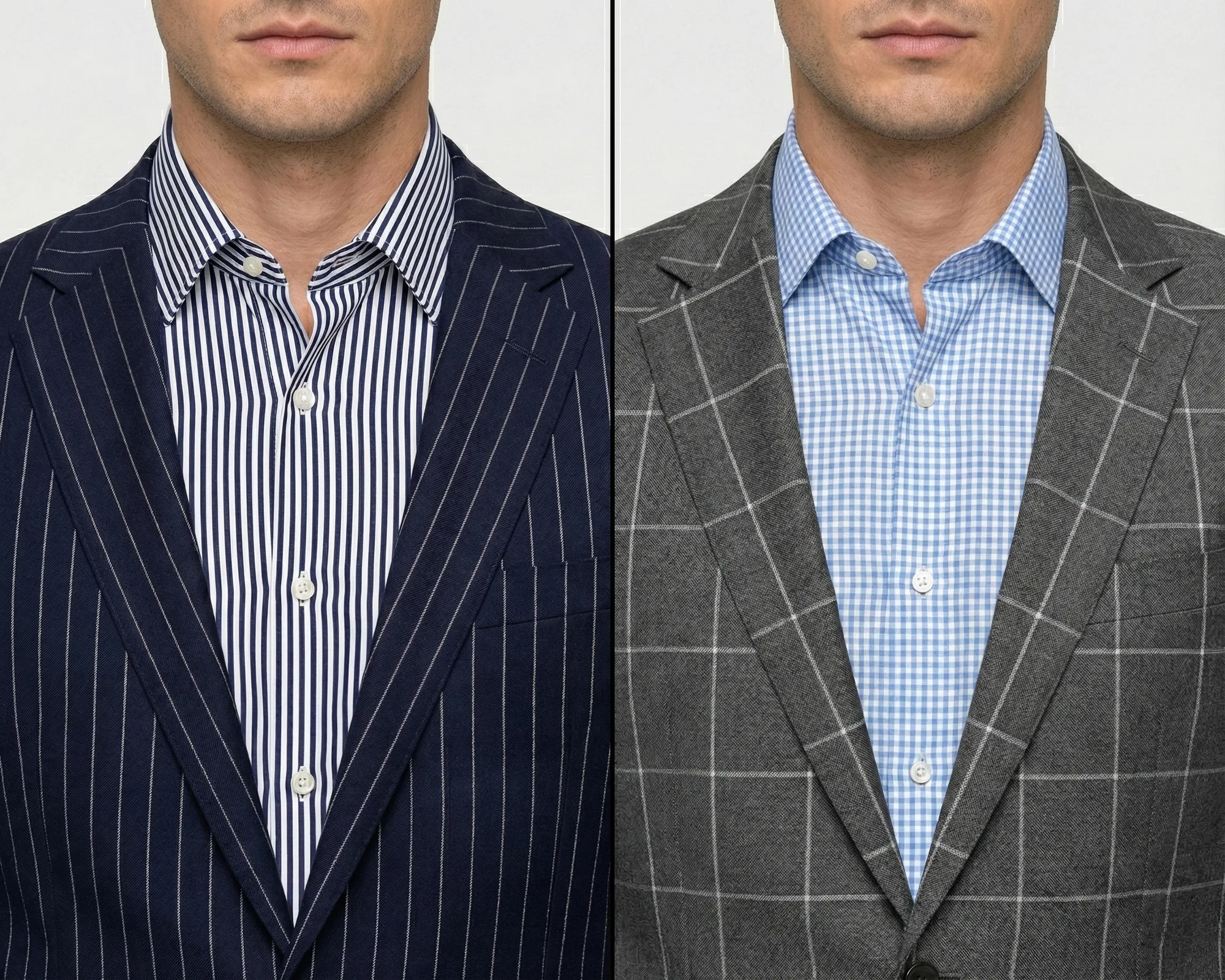
- If the Suit is Macro: For example, a bold Windowpane check suit (large squares). The shirt or tie should feature a Micro pattern, such as a fine Gingham check or a pin-dot, so it reads almost like a solid texture from a distance.
- If the Suit is Micro: Consider a classic pinstripe suit with narrow spacing, or a minute “Birdseye” weave. These patterns are so fine they almost blend into a solid color. To balance this, your tie must feature a Macro pattern, such as large Polka Dots or a wide Regimental Stripe.
The Takeaway
One pattern must dominate in size to let the other breathe. If you have to squint to tell which pattern is larger, they are too close in scale.
Golden Rule 2: The Rule of Geometry (Shape Contrast)
While Rule 1 deals with the size of the pattern, Rule 2 deals with the shape. This is arguably the safest and most effective strategy for beginners in bespoke tailoring.
The logic is simple: The human eye seeks variety. If you wear a striped suit, a striped shirt, and a striped tie, you are bombarding the viewer with redundant information. Even if the scales are different, the repetitive geometry can feel rigid and one-dimensional. To create depth, you must introduce contrast in form.
The Concept: Opposites Attract
The most harmonious outfits are often constructed by mixing the three distinct categories we defined earlier: The Linear (Stripes), The Grid (Checks), and The Organic (Dots/Curves). Because these shapes are fundamentally different, they do not compete for the same “lane” in the viewer’s brain. They coexist in separate visual layers.
The “Holy Trinity” of Pattern Mixing
For a fail-safe combination that always looks sophisticated, apply the “Holy Trinity” formula. This involves combining one of each geometric family:
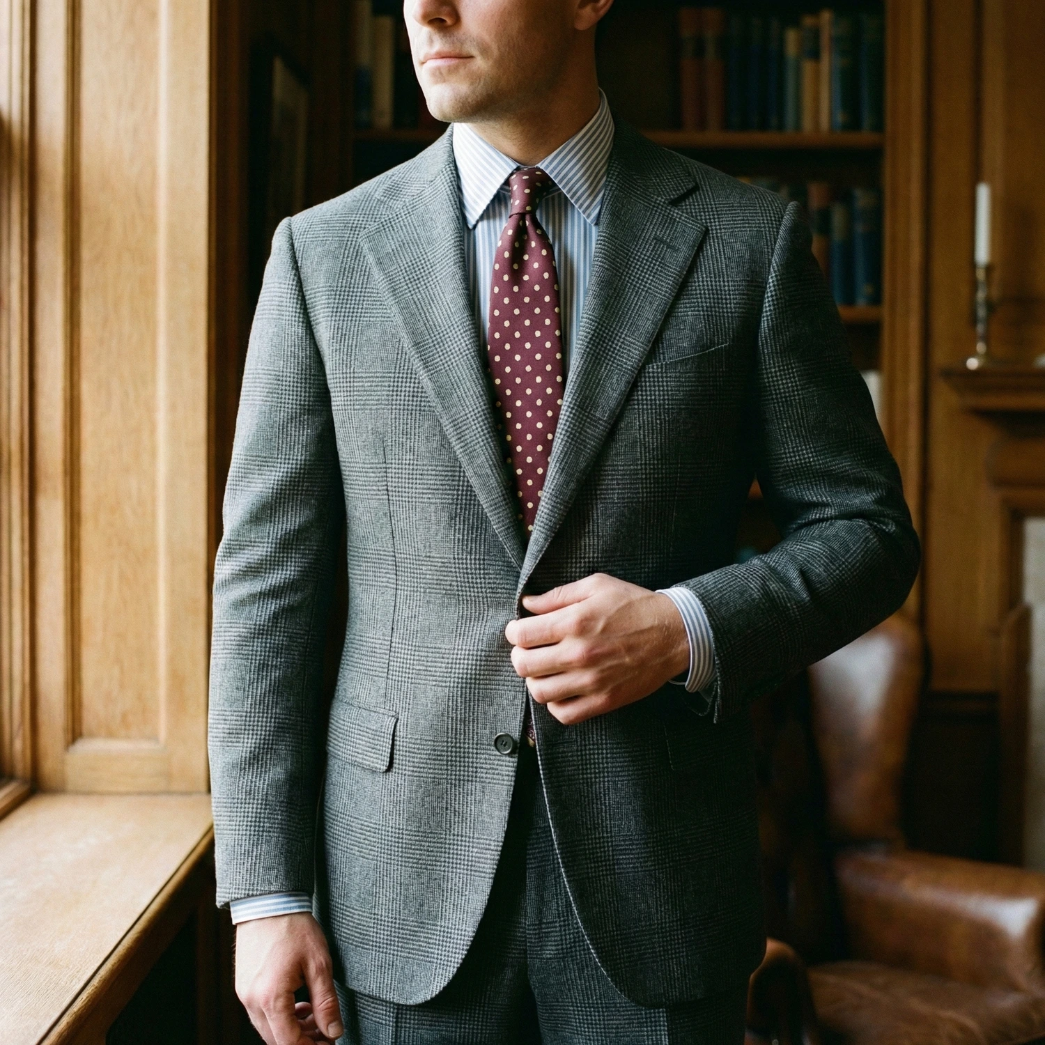
- The Foundation (Grid): Start with a Prince of Wales or Windowpane Check bespoke suit. This provides a structured, box-like framework.
- The Layer (Linear): Add a Bengal Stripe or Pencil Stripe shirt. The vertical lines cut through the boxes of the suit, creating a sharp intersection rather than a muddy blend.
- The Accent (Organic): Finish with a Polka Dot or Paisley tie. The curves and roundness of the tie soften the rigid angles of the suit and shirt.
Why It Works
This combination succeeds because every element plays a distinct role. The suit frames, the shirt lengthens, and the tie softens. By ensuring each piece has a unique geometric identity, you achieve a look that is complex in detail but perfectly balanced in the overall composition.
Golden Rule 3: The Rule of Intensity (Bold vs. Faint)
If Scale is about size and Geometry is about shape, then Intensity is about Volume. In any successful experiment of mixing patterns, you must decide which element is the “Hero” and which elements are the “Supporting Cast.”
The human brain can only process so much visual information at once. If every layer of your outfit (your suit, your shirt, and your tie) is shouting with the same high intensity, the result is visual noise that distracts from your face rather than framing it.
The Concept: The Hierarchy of Contrast
Intensity refers to how much a pattern “pops” against its background. A high-intensity pattern features stark contrast (e.g., a crisp white stripe on a charcoal background), while a faint-intensity pattern features subtle contrast (e.g., a light grey stripe on a slightly darker grey background).
The Golden Rule of Intensity is simple: Distribute your visual weight. If you choose one high-intensity garment, the other patterned elements must be muted or faint to provide a place for the eye to rest.
The Application: Balancing the “Hero”
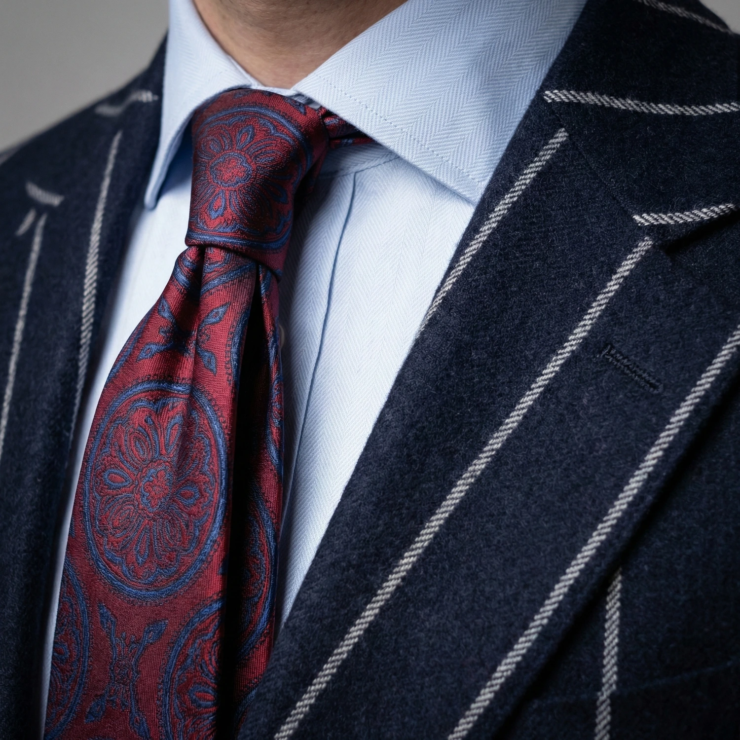
- Scenario 1: The Bold Suit. If you are wearing a bold Chalk Stripe suit with wide, high-contrast lines, the suit is the “Hero.” To balance this intensity, your shirt and tie should feature faint or tonal patterns. A light blue shirt with a very subtle, almost invisible weave (faint) will allow the suit’s stripes to command authority without creating a chaotic ensemble.
- Scenario 2: The Subtle Foundation. If you have a bespoke suit in a “shadow check” (where the pattern is only visible in certain light), you have a low-intensity foundation. This is your opportunity to push the intensity of your accessories. A bold, vibrant Paisley tie or a sharply defined Pencil Stripe shirt can take center stage without clashing with the suit.
The Buffer Zone Principle
When mixing three patterns, the most sophisticated stylists often use the shirt as a “Buffer Zone.” By choosing a shirt with the lowest intensity of the three, you create a neutral ground that prevents the pattern of the suit and the pattern of the tie from bleeding into each other.
The Takeaway
You can have multiple patterns, but you can only have one “Hero.” Master the volume of your motifs, and you master the room.
Advanced Level: Mixing Like with Like (The Virtuoso’s Challenge)
Once you have mastered the contrast of Scale and Geometry, you may choose to attempt the ultimate sartorial feat: mixing patterns from the same family. Wearing “Stripe on Stripe” or “Check on Check” is a high-risk, high-reward strategy that, when executed correctly, signals a profound level of style confidence.
The secret to making “Like on Like” work lies in an aggressive application of Rule 1 (Scale) combined with a new variable: Directional Contrast.
Stripe on Stripe: Breaking the “Barcode” Effect
The danger of wearing a striped shirt with a striped suit is looking like a visual blur. To avoid the “Barcode” effect, you must ensure two things:
- Extreme Scale Variance: If you are wearing a pinstripe suit with its signature narrow, pinpoint spacing, your shirt must feature a much wider stripe. A Candy Stripe provides a sophisticated balance, while a bold Awning Stripe serves as a high-stakes move for those embracing a more aggressive, Sprezzatura aesthetic. Conversely, a wide Chalk Stripe suit demands a very fine, dense Pencil Stripe shirt.
- Directional Shift: While suit stripes are invariably vertical, you can look for tie patterns that introduce diagonal lines (like a Regimental Repp tie). This change in direction breaks the vertical repetition and creates a focal point.
Check on Check: The Gridlock Solution
Mixing two sets of checks is technically the most difficult combination in bespoke tailoring. The eye naturally tries to align grids; if they are slightly off or too similar, it creates visual “noise.”
- The Problem: When two check patterns of similar scale meet, they create a “clashing grid” that confuses the body’s proportions and creates a vibrating effect that is exhausting to the eye.
- The Strategy: Pair a large-scale check with a micro-scale check. For example, a Windowpane bespoke suit (Macro) works beautifully with a tiny Micro-check or a fine Gingham shirt (Micro). From a distance, the shirt appears solid, providing a clean canvas for the large windowpane lines to sit upon. As you move closer, the second layer of detail reveals itself, rewarding the observer for their attention.
The Power of Three (The Triple Stripe)
The bravest connoisseurs may even attempt three of the same pattern. The formula for success here is a “Step-Ladder” of scales:
By creating a clear hierarchy of small, medium, and large, you maintain order within the same geometric family. It is a complex dance of optics that proves your mastery over the fabric.

Conclusion: Start Small
Transitioning to mixing patterns is a gradual refinement of your eye, not an overnight transformation. If the rules feel complex, remember that even the most seasoned icons of bespoke tailoring began with the basics.
You do not need to commission a bold bespoke suit immediately to prove your mastery. Start by introducing a patterned tie against a solid foundation, or a micro-check shirt under a classic jacket. Once you become comfortable with these subtle shifts in scale and geometry, complex combinations will become second nature. Dress with intent, respect the mathematics of style, and eventually, elegance will become your greatest instinct.
DISCOVER PHYIGITAL BESPOKE TAILORING