Beyond the Blue: Introducing Earth Tones and Pastels to Your Wardrobe
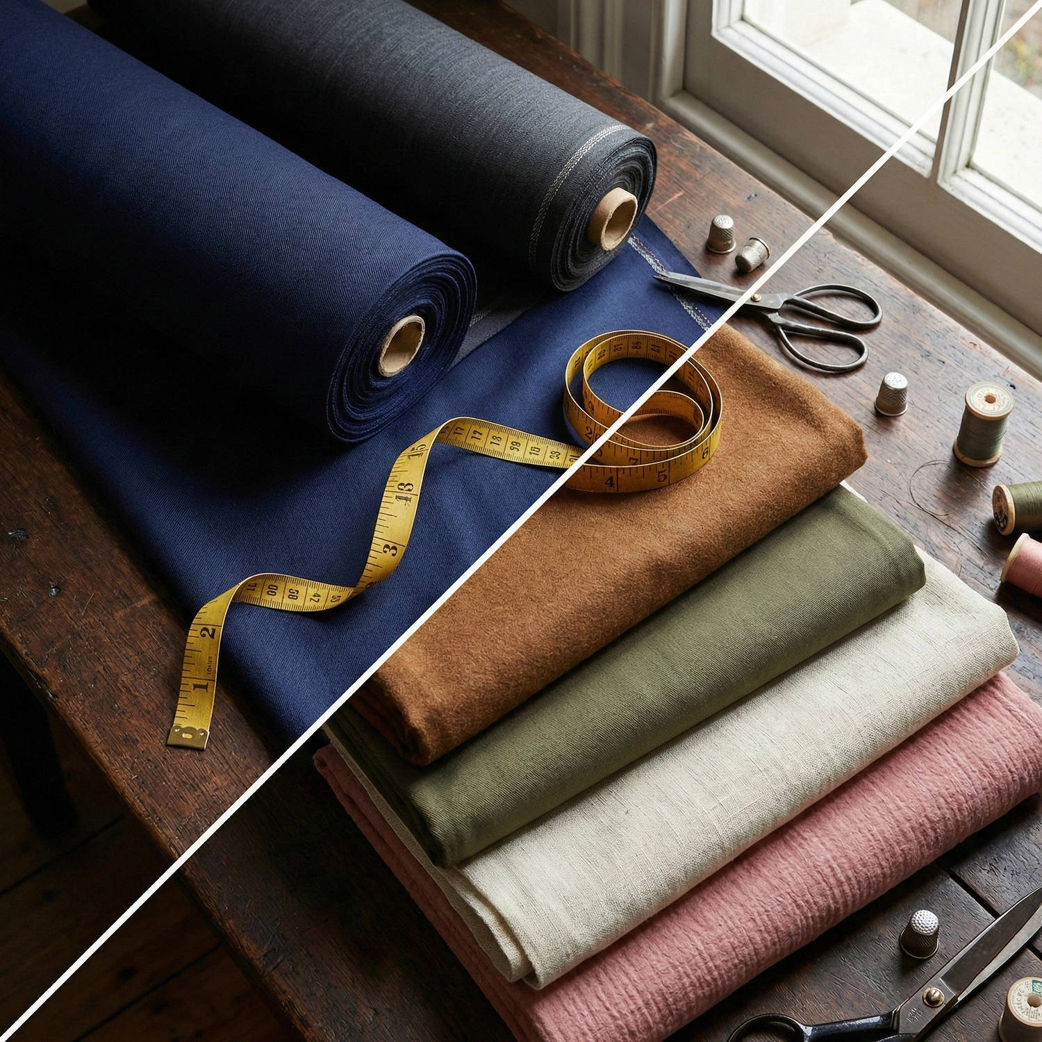
Open the wardrobe of the average professional, and you will likely find a monochromatic sea of Navy Blue and Charcoal Grey. While these colors ensure you never look wrong, reliance on them often crosses the line from strategic to sterile. To truly master style, you must eventually step into the “Warm Spectrum”: Earth Tones and Pastel Colors.
For many, this transition is paralyzed by fear: the worry that Brown looks “dated” or that Pastels appear “soft.” This guide effectively dismantles those myths. By applying specific rules of contrast and texture, we will demonstrate how to wear Tobacco, Olive, and Cream with the same sharpness and authority as your trusty Navy suit.
The Science of Earth Tones & Pastels
To master these colors, we must understand that neither Earth Tones nor Pastels are “pure” colors. They are modified hues, altered by specific variables.
Earth Tones (The Ground)
These are colors with low saturation. By mixing vivid primary colors with grey, we “ground” them. Orange becomes Tobacco; Yellow becomes Mustard. Psychologically, these hues mimic nature (wood, stone, soil), projecting stability and reliability.
Pastels (The Light)
These are colors with high luminosity. Created by adding white to a pure hue (Tinting), pastels reflect light rather than absorbing it. While Earth Tones represent the ground, Pastels represent the energy and optimism of high summer.
The Sartorial Axis
The challenge lies in the lack of safety found in Navy and Grey.
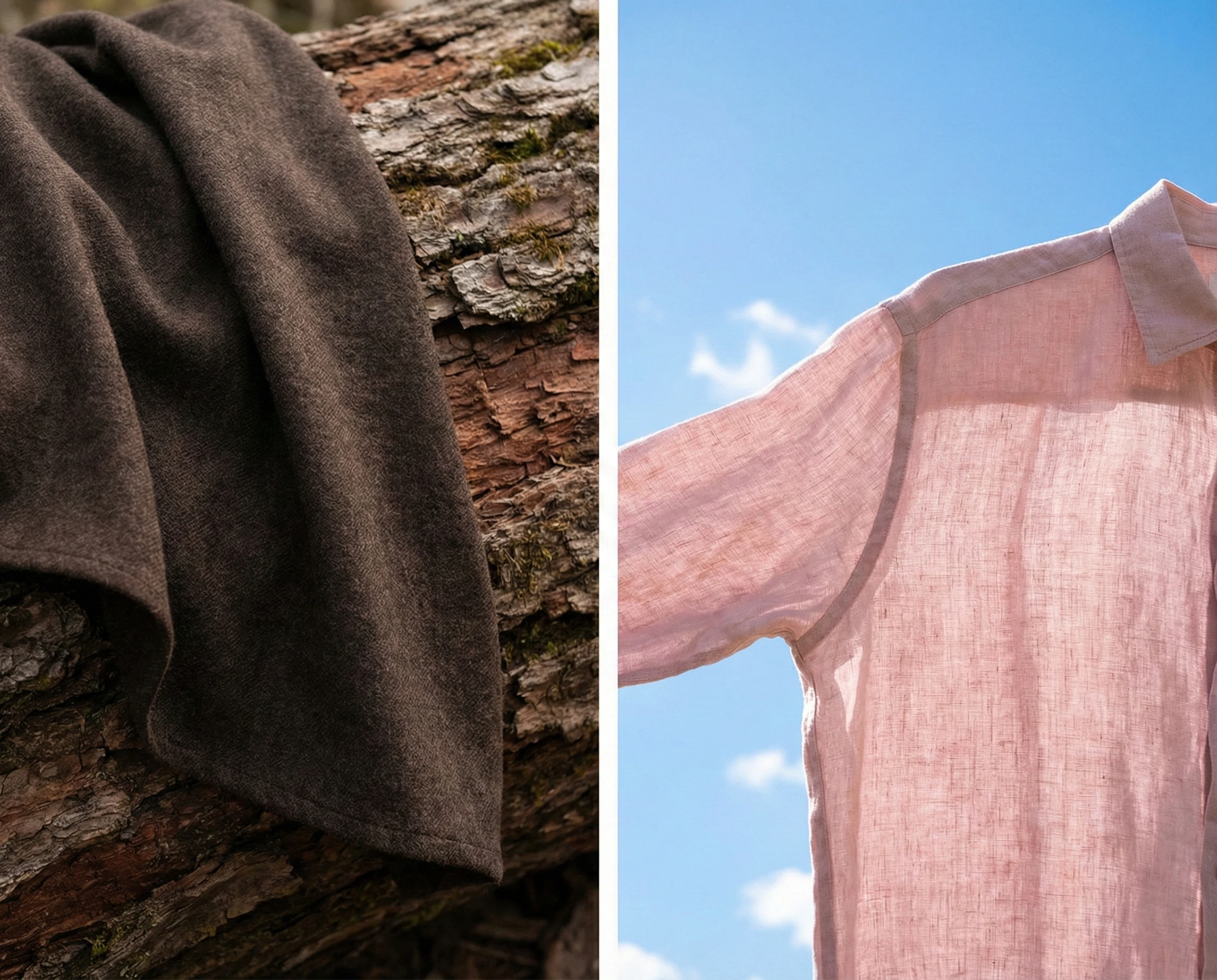
- Earth Tones require texture to avoid looking muddy.
- Pastels require contrast to avoid looking washed out. Understanding this balance is the key to the practical rules below.
Mastering the Earth Palette (The Execution Manual)
While the Earth Tone spectrum is vast (ranging from the vibrant burnt oranges of Terracotta to the dusty yellows of Mustard) not all shades are suitable for a full suit. In the world of high-end bespoke tailoring, we narrow our focus to the “Cardinal Four.” These are the foundational hues that have stood the test of time, offering the versatility of a neutral while providing significantly more character than grey.
Here is the tactical guide to modernizing these four essential colors.
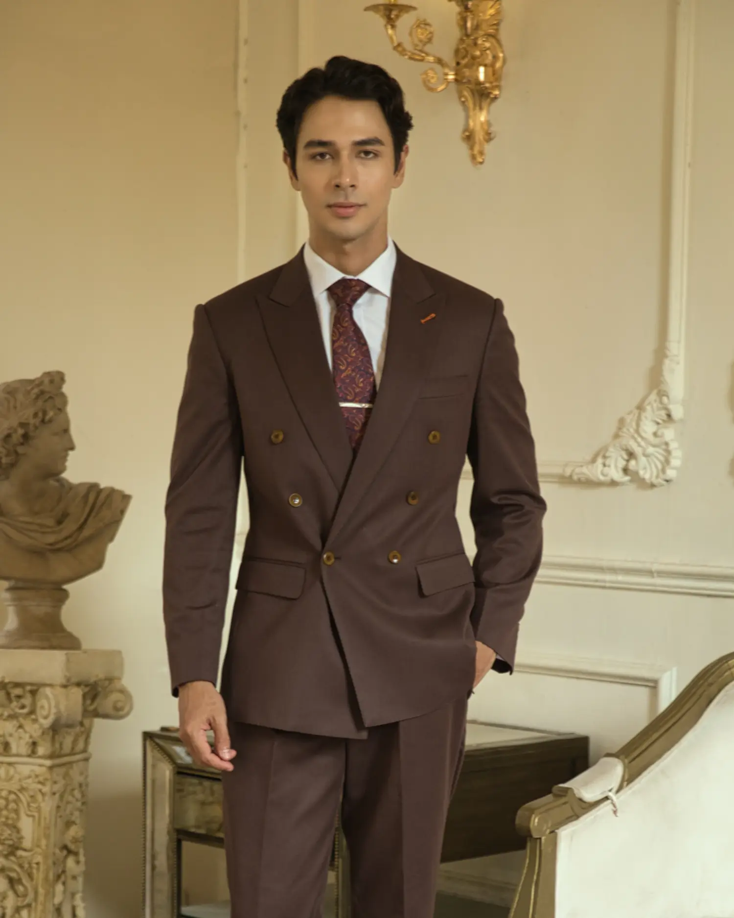
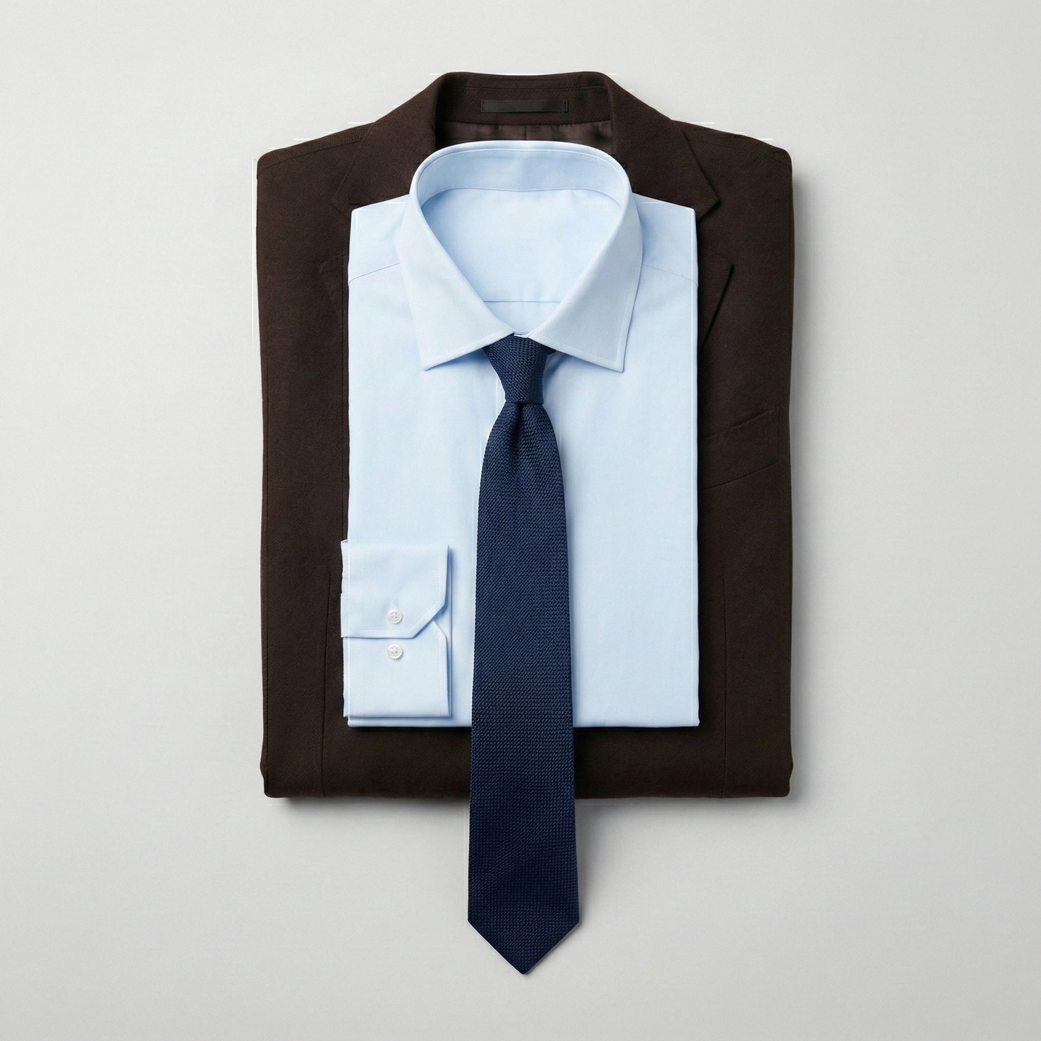
The Chocolate Brown Suit (The Power Alternative)
The Concept: Think of Dark Brown as “Warm Charcoal.” It possesses the same gravitas and seriousness as a dark grey suit but offers a richness that feels more sophisticated and less corporate.
The Risk (The “Dated” Trap): Pairing a brown suit with warm accessories (like a cream shirt, gold tie, or tan shoes) creates a “monochrome heat” that instantly ages the wearer, evoking the image of a dusty academic.
The Winning Combo (The “Cooling” Protocol):
- Suit: Dark Chocolate Flannel or High-Twist Wool (Matte finish).
- Shirt: Ice Blue. This is non-negotiable. The cold temperature of the light blue shirt neutralizes the heat of the brown jacket, creating a crisp, modern contrast.
- Tie: Navy Blue Grenadine.
- Why it works: You are effectively sandwiching the warm brown between cool blues, forcing the outfit to look sharp rather than “muddy.”
The Tobacco Suit (The Connoisseur’s Choice)
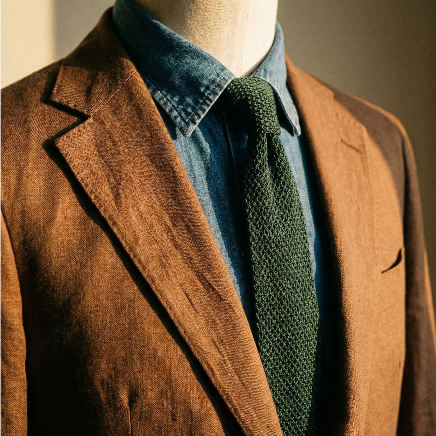
The Concept: A reddish, cigar-leaf brown. This is the hallmark of Italian Sprezzatura. It is bolder and more vibrant than chocolate brown.
The Risk: Because the color is intense, it can easily overpower your face. If worn in a shiny fabric, it looks cheap and costume-like.
The Winning Combo (Texture Suppression):
- Suit: Tobacco Summer Suit in Linen or Cotton.
- Shirt: Denim or Chambray. The rugged texture of denim “de-formalizes” the suit and adds a youthful, masculine edge that completely removes the “old man” factor.
- Tie: Forest Green Knit Tie.
- Why it works: Green and Red (the undertone of tobacco) are complementary colors. The knit texture softens the look further.
The Olive Green Suit (The Intellectual Choice)
The Concept: Olive is the third essential color for men, ranking just behind Navy and Grey. It signals intellect and creativity rather than corporate rigidity.
The Risk: Looking like “Military Surplus” or having the green cast make your skin look sickly.
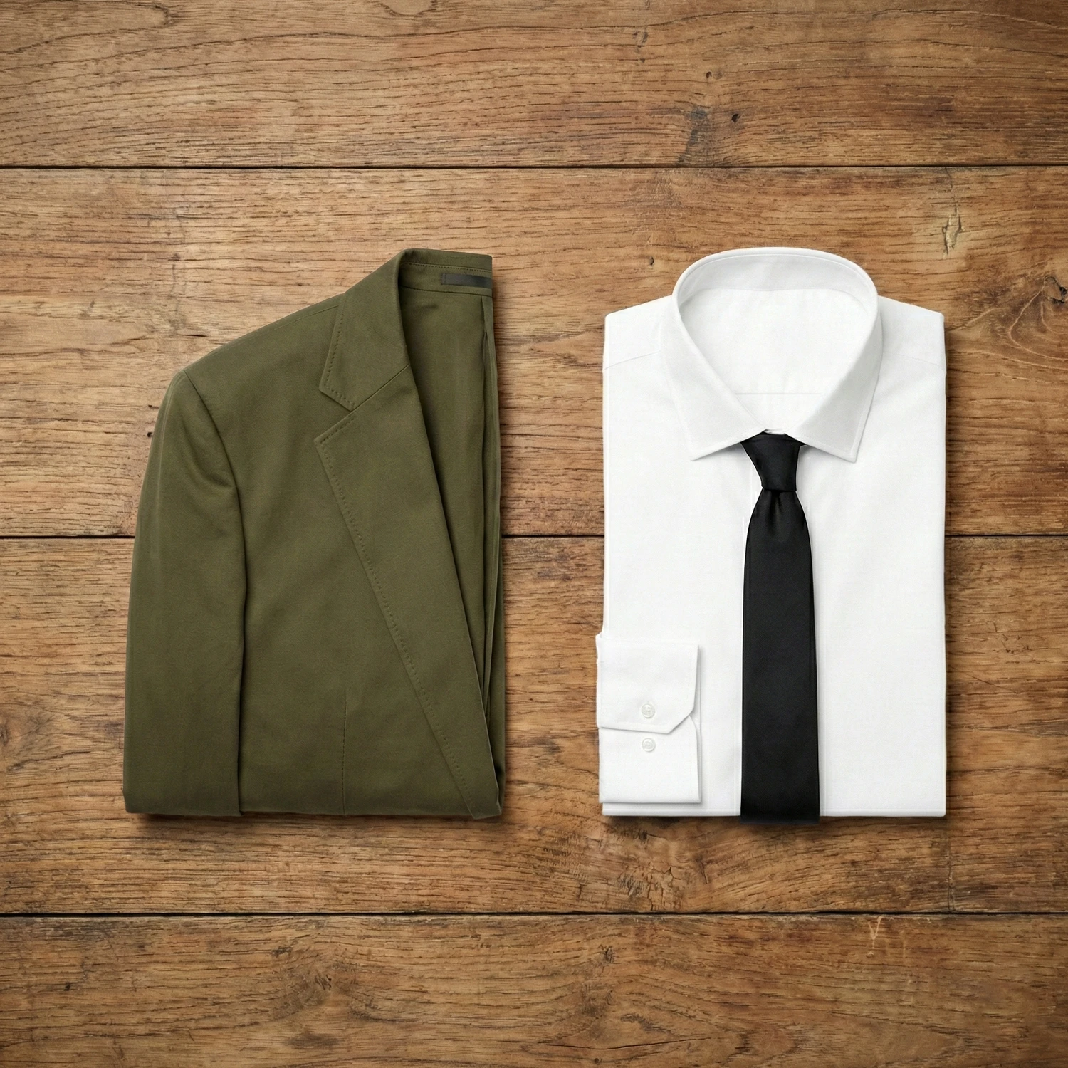
The Winning Combo (Sharpening the Edge):
- Suit: Olive Green Suit in Cotton Drill or Gabardine.
- Shirt: Crisp White. You need maximum brightness to lift the green. Avoid cream or blue here; only white provides the necessary “pop.”
- Tie: Black.
- Why it works: This is a Milanese secret. Pairing the earthy, rural vibe of Olive with the sharp, urban vibe of Black creates a “High-Contrast Urban Chic” look that is impossible to mistake for a military uniform.
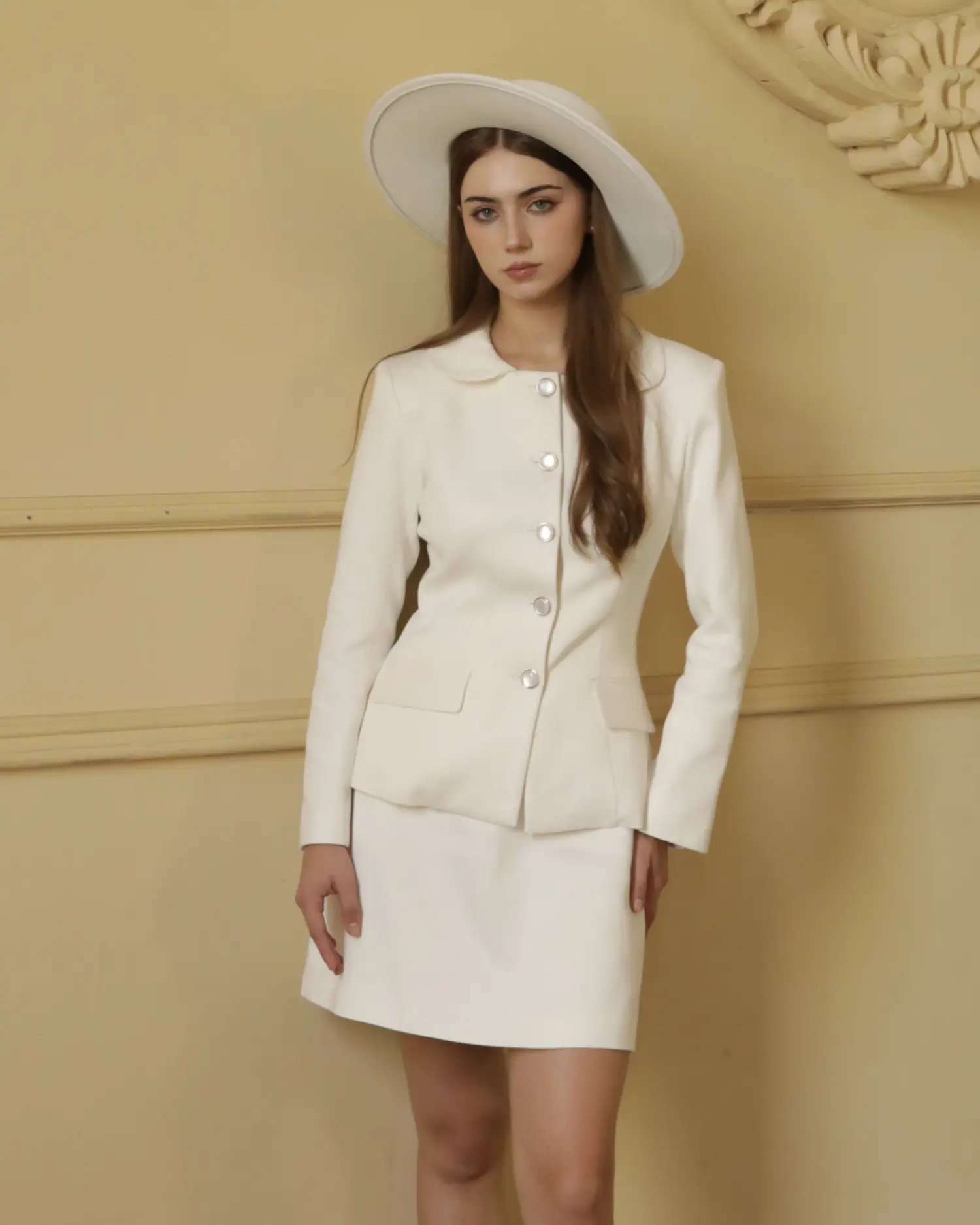
The Beige Suit (Summer Elegance)
The Concept: The ultimate summer suit. It reflects sunlight, keeping you cool while projecting an air of leisure.
The Risk: The “Washed Out” effect. If the beige suit is too close to your skin tone, you disappear.
The Winning Combo (Visual Anchoring):
- Suit: Beige/Cream Linen or Solaro fabric.
- Shirt: Light Blue Striped. The vertical stripes provide a geometric barrier between the beige jacket and your neck, ensuring your face remains framed.
- Shoes: Dark Brown Suede Loafers (Authority) or Tan (Leisure). While black shoes are often too harsh, the choice of brown dictates the formality. Dark Brown provides the necessary “visual weight” to anchor the suit for business settings. Conversely, lighter Tan or Cognac shades create a seamless “Resort” vibe, perfect for social occasions.
Pastels – The Science of Summer Tints
If Earth Tones represent the ground, Pastel colors represent the light.
In physics, Pastels have high Luminosity (light reflection). This makes them the scientifically superior choice for summer tailoring, as they reflect sunlight rather than absorbing it like Navy or Black. However, wearing a full suit in a pastel shade carries a high risk: the fear of looking like a “cartoon character.” The secret to wearing a Pastel Suit with masculinity and authority lies entirely in Texture.
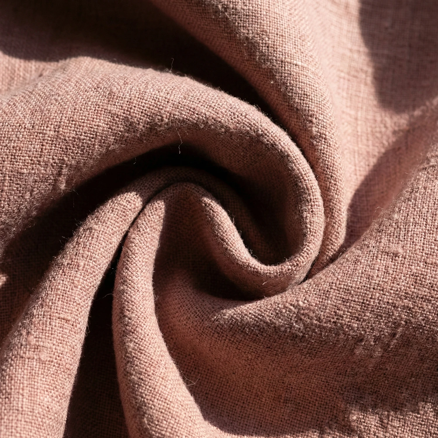
The Material Mandate: Never wear a pastel suit in a shiny fabric (like smooth wool or silk). It must be Matte & Textured (Linen, Cotton, Seersucker). The roughness of the fabric grounds the softness of the color.
Here are the three essential Summer Pastel looks, ranked by sartorial difficulty.
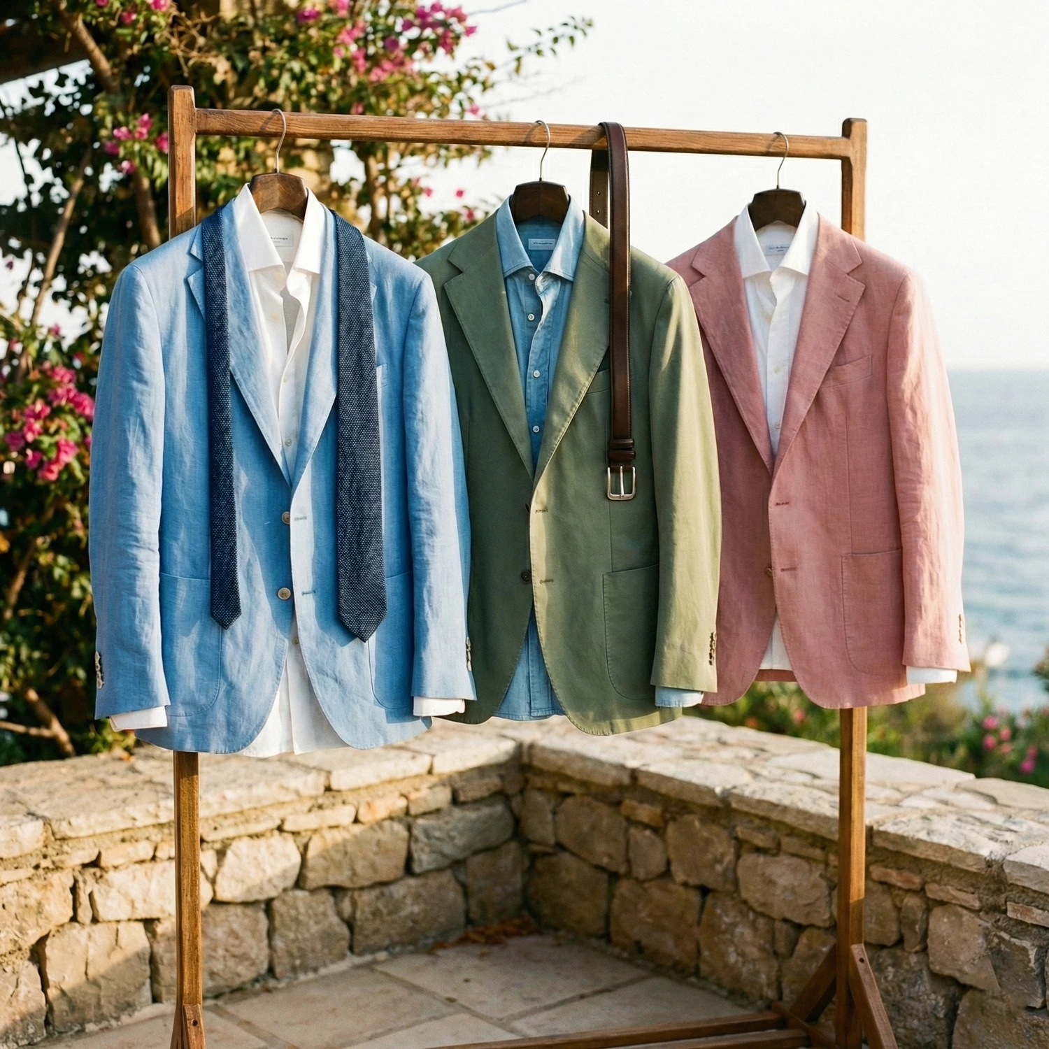
The Light Blue Suit (The Entry Level)
The Concept: This is the easiest transition from Navy. It is essentially a “Pastel Navy”: same family, just higher exposure. It is the quintessential summer wedding or garden party attire.
The Risk: Looking “washed out” or indistinguishable from a standard office shirt.
The Winning Combo (Tone-on-Tone Authority):
- The Suit: Sky Blue or Powder Blue (100% Linen or Seersucker). The natural wrinkles of the linen are essential here: they prove it is a leisure suit, not a work uniform.
- The Shirt: White. A crisp white open-collar shirt keeps it fresh.
- The Tie (Optional): Navy Blue.
- Why it works: You are keeping the entire outfit in the Blue Spectrum (Monochromatic). The Navy tie anchors the Light Blue suit, creating a professional gradient that looks intentional, not accidental.
The Sage Green Suit (The Sophisticated Choice)
The Concept: A muted, grayish-green tint. Unlike the dark Olive Green mentioned in Part 2, Sage is airy and cool. In modern tailoring, it is rapidly becoming the “New Beige”: a neutral that is just as versatile as cream but significantly more interesting.
The Risk: Looking like surgical scrubs (if the fabric is too smooth).
The Winning Combo (The Earthy Anchor):
- The Suit: Sage Green (Cotton Drill or Irish Linen).
- The Shirt: Light Blue or Denim.
- The Accessories: Dark Brown Loafers and Belt.
- Why it works: We apply the “Earth & Sky” logic. The Green suit represents nature; the Blue shirt represents the sky; the Brown shoes represent the earth. It is a naturally harmonious palette that removes any “medical” connotation from the green.
The Dusty Pink Jacket (The “Broken Suit” Strategy)
The Concept: A full pink suit takes immense confidence (and often looks best only at Pitti Uomo). For the practical gentleman, the strategy is “Spezzato” (The Broken Suit). Use the jacket as the hero piece to separate the color blocks.
The Risk: Looking effeminate or “costumey.”
The Winning Combo (The Hard/Soft Protocol):
- The Jacket: Dusty Pink (Unstructured Linen Sport Coat).
- The Trousers: White or Cream Cotton Trousers. (Or even tailored Jeans for a casual look).
- The Shirt: White Poplin.
- Why it works: By isolating the Pink to just the jacket and pairing it with neutral, bright trousers, you create a “Riviera” look. The white trousers act as a reflector, making the pink jacket pop without overwhelming the viewer.
The Universal Protocols (Anti-Aging & Pro-Authority)
Crossing over from the Cool Spectrum (Navy/Grey) to the Warm Spectrum (Earth/Pastels) requires a shift in mindset. These colors behave differently under light and interact differently with your body shape. To ensure you look authoritative (and never “dated” or “soft”) you must adhere to three universal protocols.
Protocol 1: The “Palate Cleanser” Rule
The biggest mistake men make with Earth Tones is “muddying” the look (e.g., Brown suit + Beige shirt + Brown tie). The biggest mistake with Pastels is “washing out” the face.
- The Law: You always need a “Palate Cleanser” near your face.
- The Execution: Regardless of whether you are wearing a Tobacco Brown or a Sage Green suit, your safest bet is a Crisp White or Ice Blue shirt. These cold, high-contrast neutrals act as a visual “reset button,” preventing the outfit from looking like a costume and ensuring your face remains the focal point.
Protocol 2: The “Matte” Mandate (Texture is King)
We cannot stress this enough: The Warm Spectrum fails on shiny fabrics.
- A shiny Navy suit looks like a boardroom power move.
- A shiny Brown suit looks like a relic from the 1970s (The “Used Car Salesman” effect).
- A shiny Pink suit looks like cheap synthetic formalwear.
- The Law: Earth Tones and Pastels must be worn in Matte textures.
- The Execution: Stick to light-absorbing fabrics. In winter, choose Flannel, Tweed, or Corduroy. In summer, choose Linen, Seersucker, or Cotton Drill. The rougher the texture, the more sophisticated the color appears.
Protocol 3: The Silhouette Compensation
Optics dictates that “Cool colors retreat, Warm colors advance.” A Navy suit is naturally slimming because it absorbs light. A Beige or Pastel suit reflects light, visually “expanding” your figure.
- The Law: Warm colors require sharper tailoring.
- The Execution: A loose-fitting Navy suit is forgivable; a loose-fitting Beige suit looks sloppy. When commissioning a suit in the Warm Spectrum, ensure the fit is precise: sharp shoulders, a clean waist suppression, and zero break on the trousers. The structural sharpness of the cut compensates for the visual softness of the color.
Conclusion: Expanding Your Horizons
Color is a language. While Navy and Grey speak of corporate duty, Earth Tones and Pastels speak of confidence and character. Transitioning to this palette implies no loss of authority, only an upgrade in style. By strictly adhering to the rules of Contrast and Texture, you can wear a Tobacco suit with the same commanding presence as your darkest Charcoal.
Start Small: Begin with a Sage Green sport coat or Chocolate Brown trousers. Once you experience how these hues warm up your complexion and distinguish you from the crowd, the “Cool Spectrum” will no longer feel like a safety net, but a limitation.
Now that you have stepped into the warmth of Earth Tones, understand how they fit into the broader rules of proportion and fabric. Revisit our foundational bible: [The Science of Elegance: The Ultimate Bespoke Tailoring Style Guide] to perfect every inch of your commission.
DISCOVER PHYIGITAL BESPOKE TAILORING